
Aspect Ratio
Branding, Graphic Design, Concept
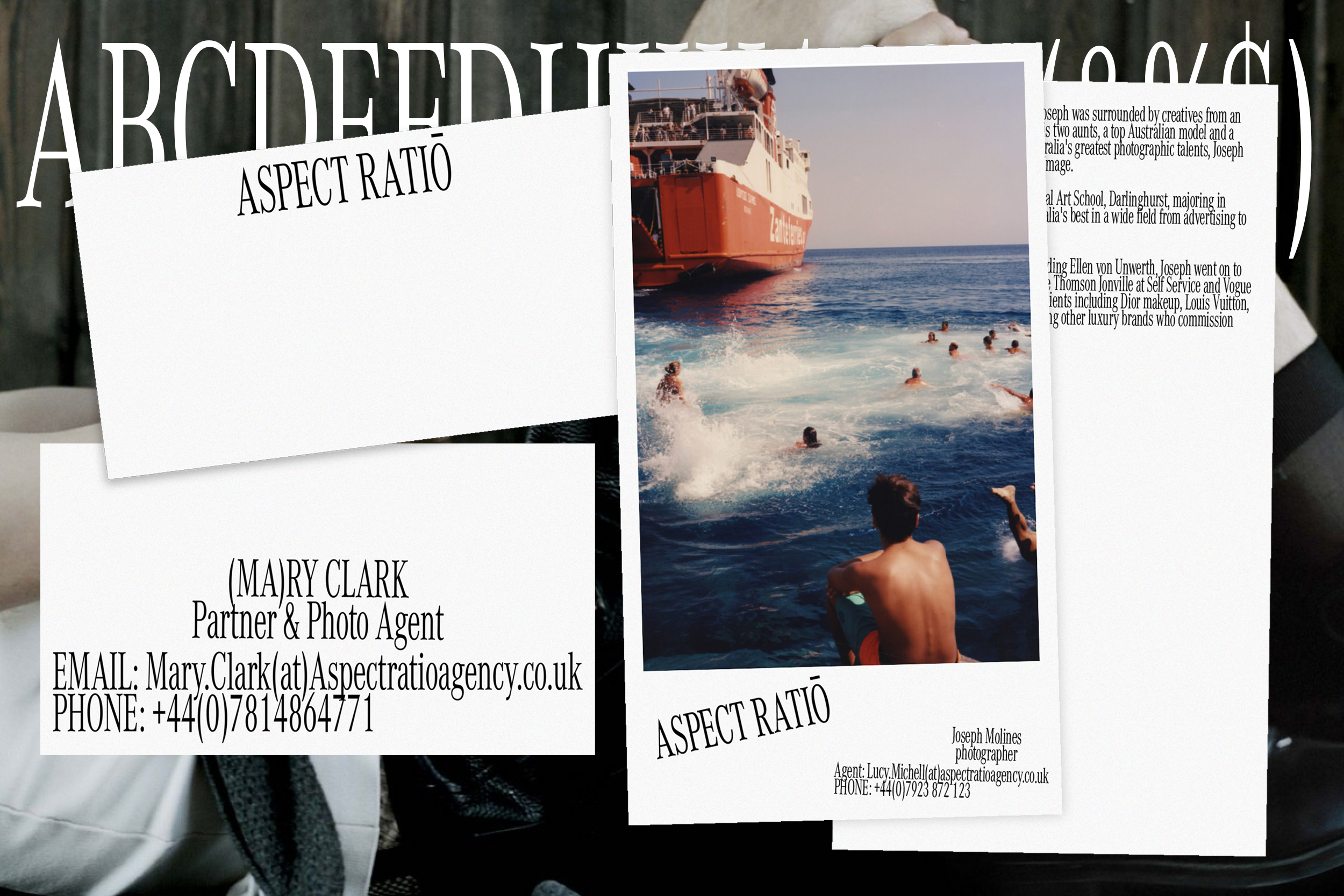
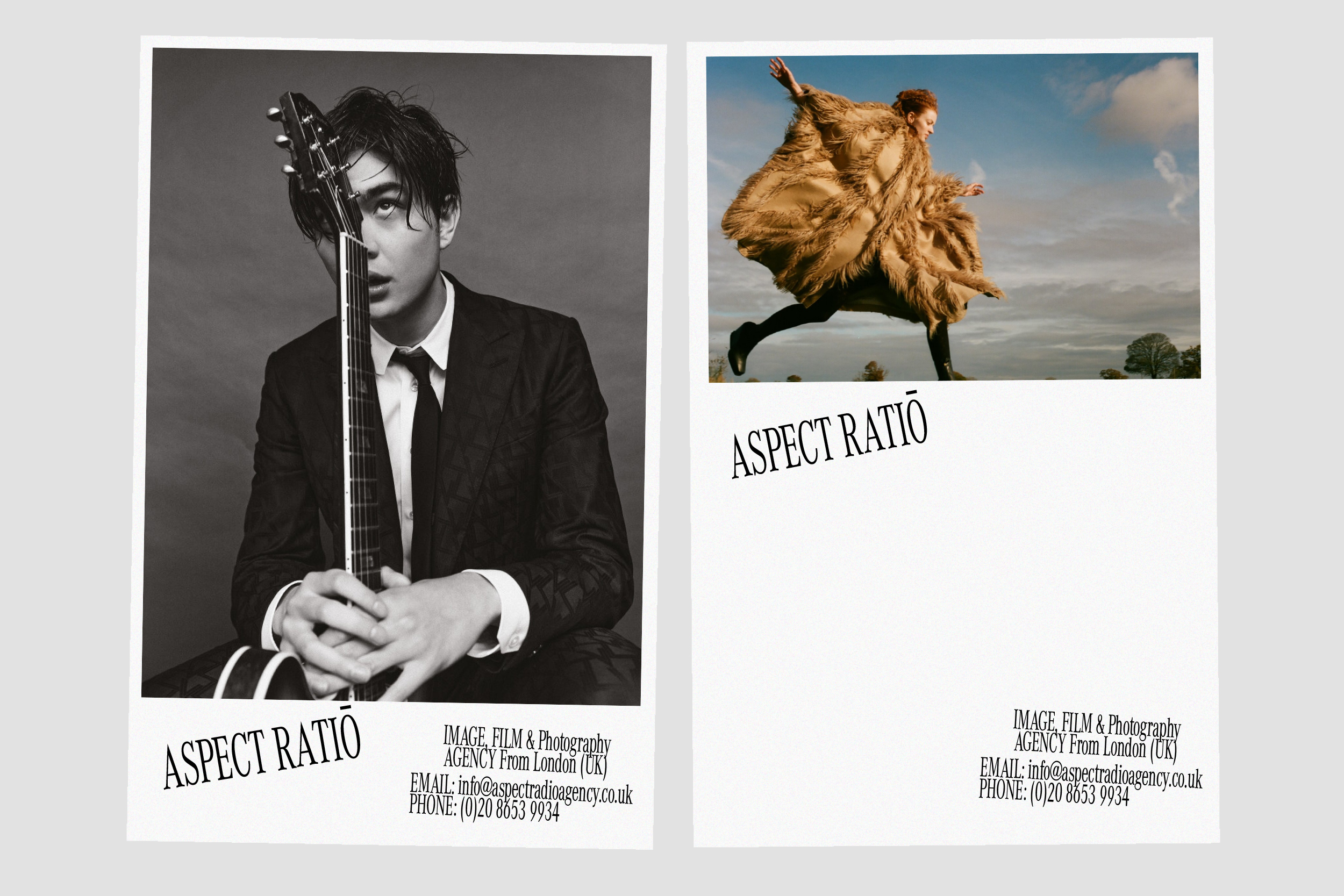
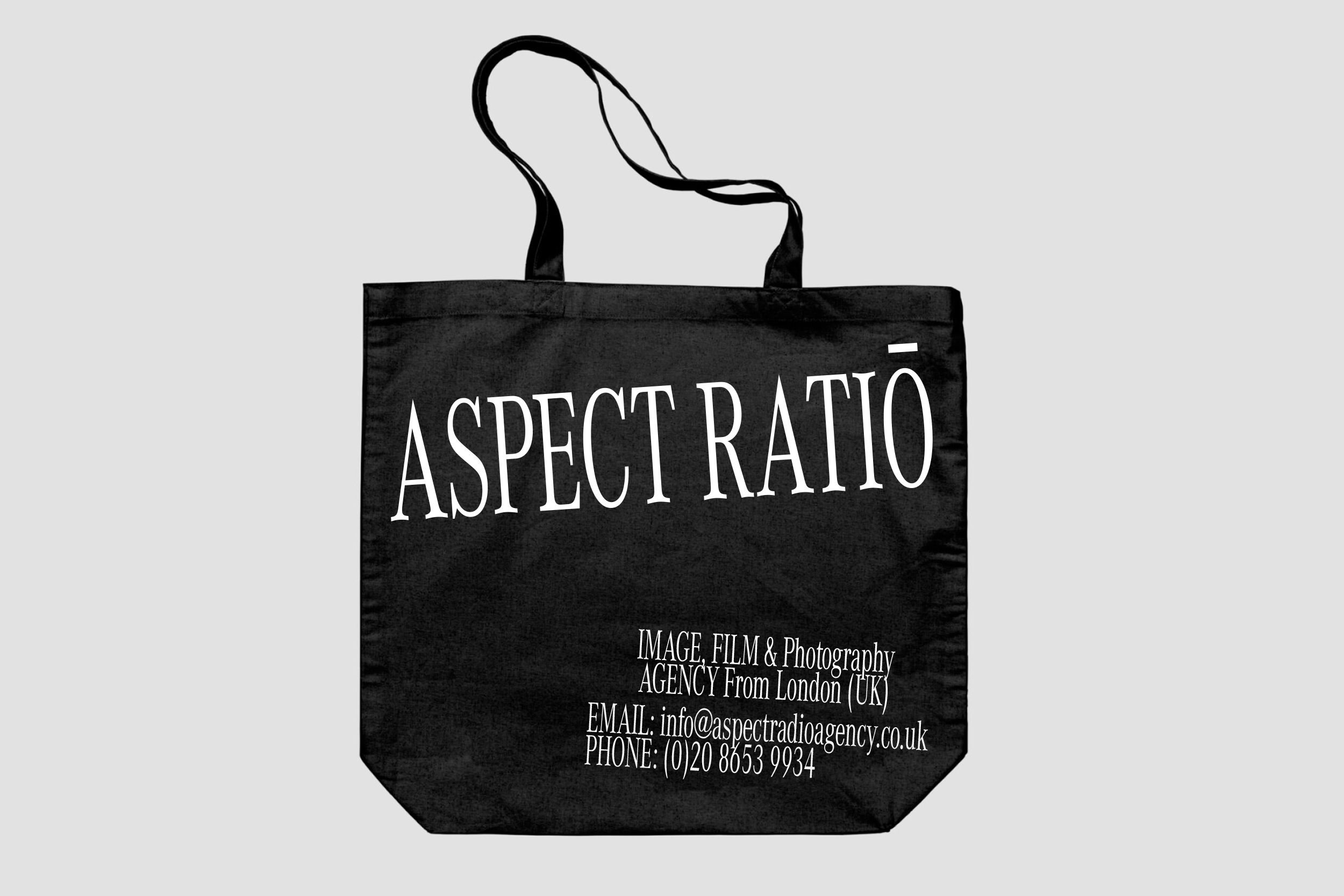
A creative exploration & initial concepts for a London Based Photo management agency. Inspired by the subtle notions of a ‘new perspective’, basing creative & typographic design decisions on a key photography terminology. Exploring ways to push conventional typography in my own time.
Aspect Ratio
Branding, Graphic Design, ConceptA creative exploration & initial concepts for a London Based Photo management agency. Inspired by the subtle notions of a ‘new perspective’, basing creative & typographic design decisions on a key photography terminology. Exploring ways to push conventional typography in my own time.
-------
Axel Arigato NYC Launch Teaser
Art Direction
To coincide with the brands New York launch, commissioning a London based studio, Inertia to support in the development and creation of a 3D Exploration. Based on the idea of a “takeover”, brining Axel Arigato to life through a playful use of its core colour palette and hero product.
3D: Inertia Studios
Creative Director: Jens Werner
-------
To coincide with the brands New York launch, commissioning a London based studio, Inertia to support in the development and creation of a 3D Exploration. Based on the idea of a “takeover”, brining Axel Arigato to life through a playful use of its core colour palette and hero product.
Axel Arigato NYC Launch Teaser
Art DirectionTo coincide with the brands New York launch, commissioning a London based studio, Inertia to support in the development and creation of a 3D Exploration. Based on the idea of a “takeover”, brining Axel Arigato to life through a playful use of its core colour palette and hero product.
3D: Inertia Studios
Creative Director: Jens Werner


Axel Arigato x Transparent Speaker [VIEW FULL PROJECT ︎]
Art Direction, Editorial, Branding
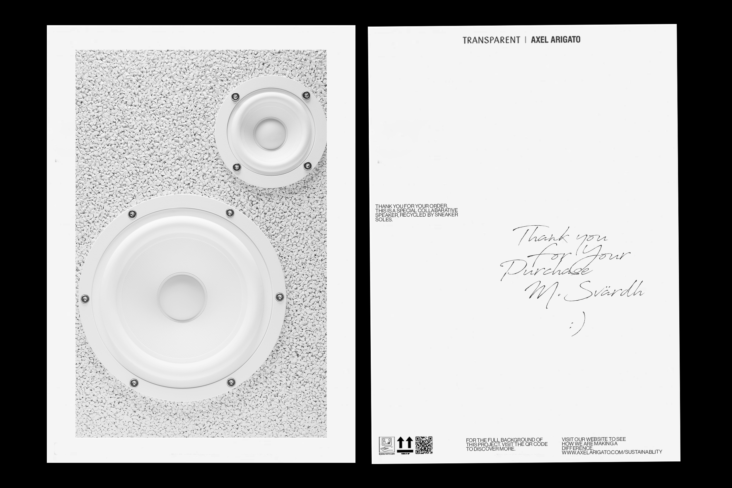
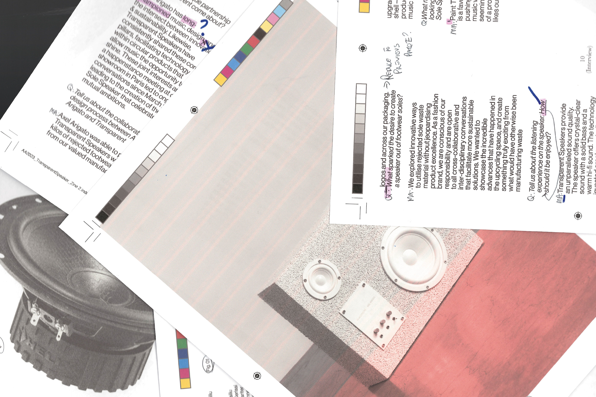
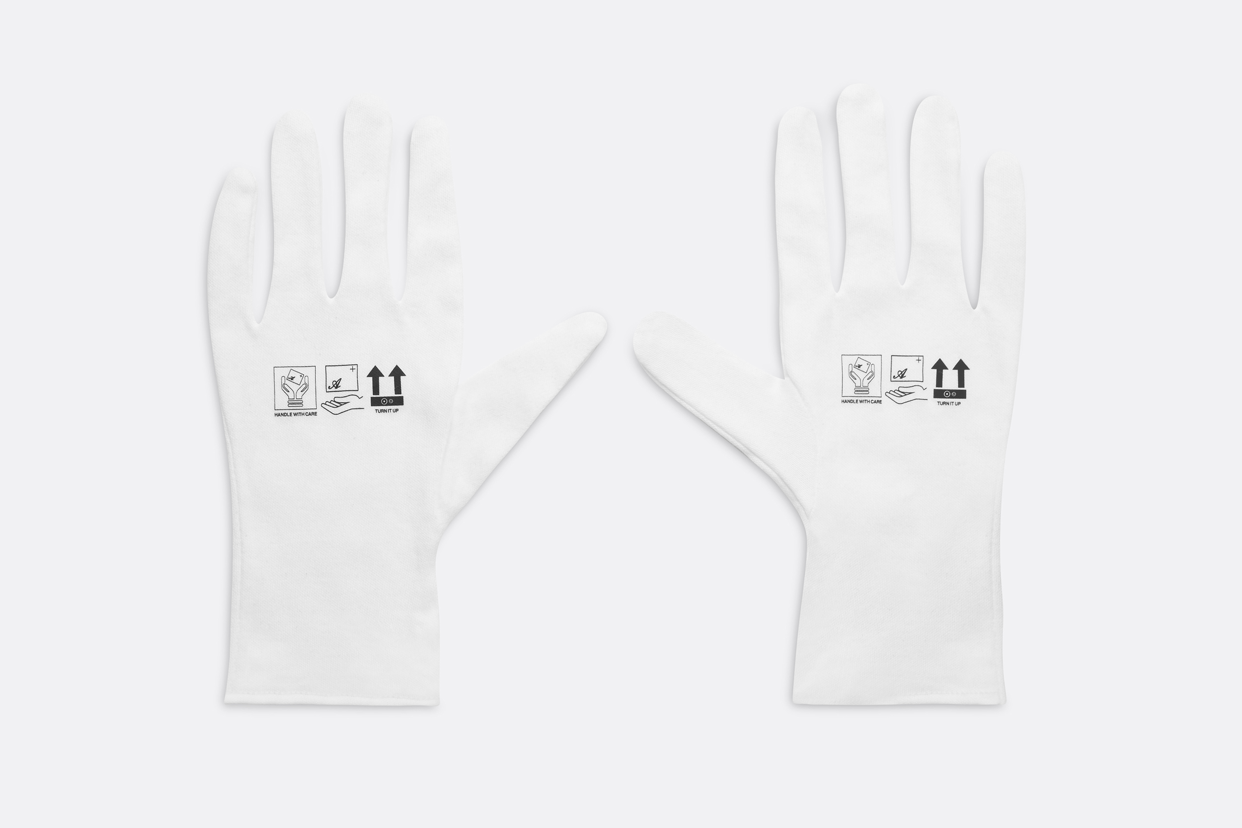
Since 2014, Axel Arigato has been curating memorable moments for its community through music. A collaboration between two Nordic powerhouses, weaving both music & fashion together, to create a limited-edition speaker formed from recycled soles. A full 360 campaign, featuring artistic direction across print & digital
Typeface: Neue Haas Grotesk
Print: Mount Street Printers
Creative Director: Max Svärdh (Co-Founder)
Axel Arigato x Transparent Speaker [VIEW FULL PROJECT ︎]
Art Direction, Editorial, BrandingSince 2014, Axel Arigato has been curating memorable moments for its community through music. A collaboration between two Nordic powerhouses, weaving both music & fashion together, to create a limited-edition speaker formed from recycled soles. A full 360 campaign, featuring artistic direction across print & digital
Typeface: Neue Haas Grotesk
Print: Mount Street Printers
Creative Director: Max Svärdh (Co-Founder)
Print: Mount Street Printers
Creative Director: Max Svärdh (Co-Founder)
-------
Pyro Sneaker Launch
Branding, Graphic Direction
The Pyro has been a standout silhouette of its season. Its visible fluid lines and perforations that highlight its organic shape really express the forward-thinking, future driven progression of Axel Arigato. Taking notions of this throughout, we produced a full graphic direction for this launch, coinciding with a series of 3D motion graphics and identity, expressing the raw nature that makes up compounds of the sneaker and futuristic take on a forward-thinking product category.
3D Design: New Format
CGI: Fernando Gorgolas
Typeface: Custom Design
Art Direction: Nathan Singh/Milan Miladinov
Sound Design: New Format
Graphic Direction: Nathan Singh
Pyro Sneaker Launch
Branding, Graphic DirectionThe Pyro has been a standout silhouette of its season. Its visible fluid lines and perforations that highlight its organic shape really express the forward-thinking, future driven progression of Axel Arigato. Taking notions of this throughout, we produced a full graphic direction for this launch, coinciding with a series of 3D motion graphics and identity, expressing the raw nature that makes up compounds of the sneaker and futuristic take on a forward-thinking product category.
3D Design: New Format
CGI: Fernando Gorgolas
Typeface: Custom Design
Art Direction: Nathan Singh/Milan Miladinov
Sound Design: New Format
Graphic Direction: Nathan Singh
CGI: Fernando Gorgolas
Typeface: Custom Design
Art Direction: Nathan Singh/Milan Miladinov
Sound Design: New Format
Graphic Direction: Nathan Singh


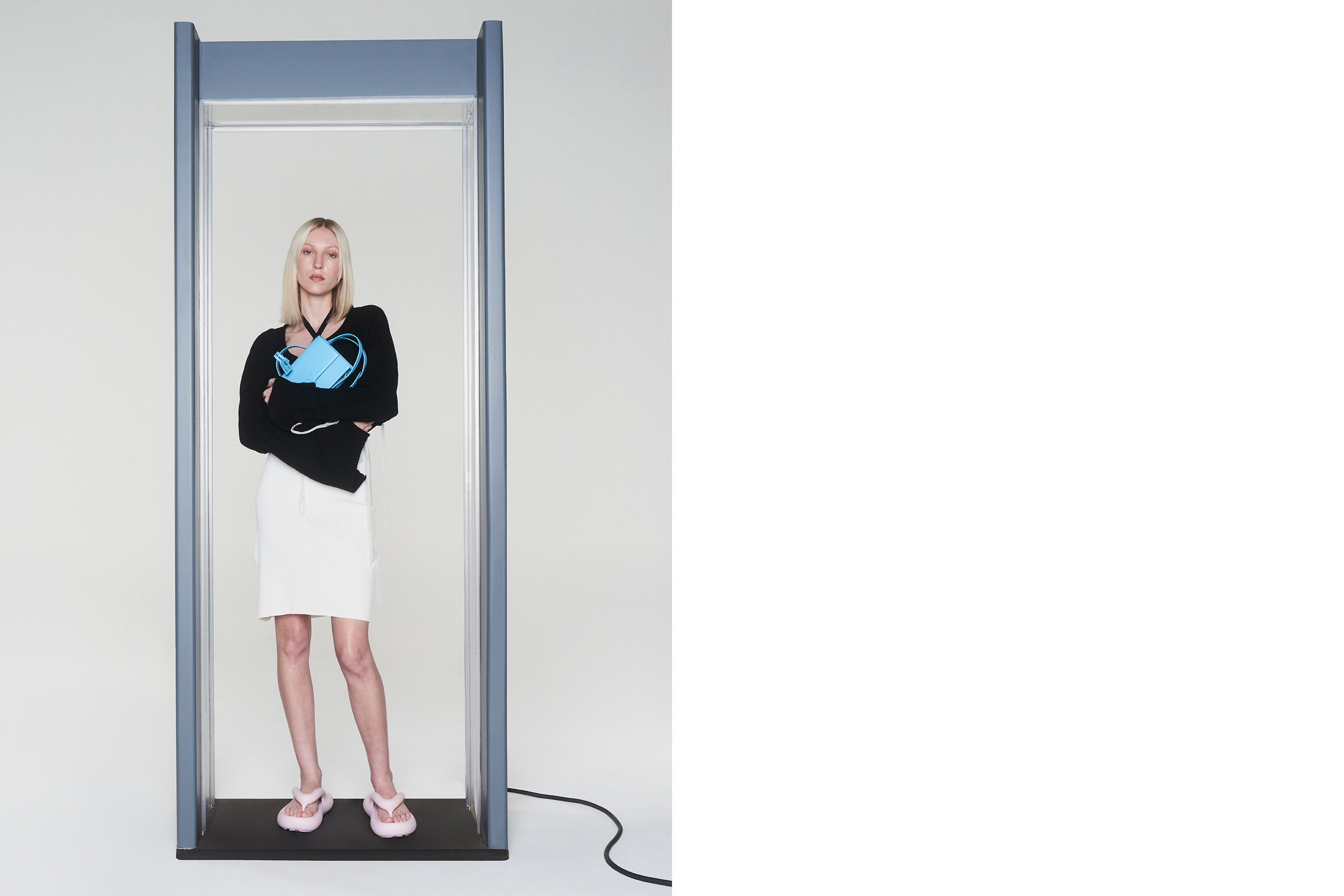
Axel Arigato Pre-SS23 Campaign
Art Direction, Graphic Design, Campaign
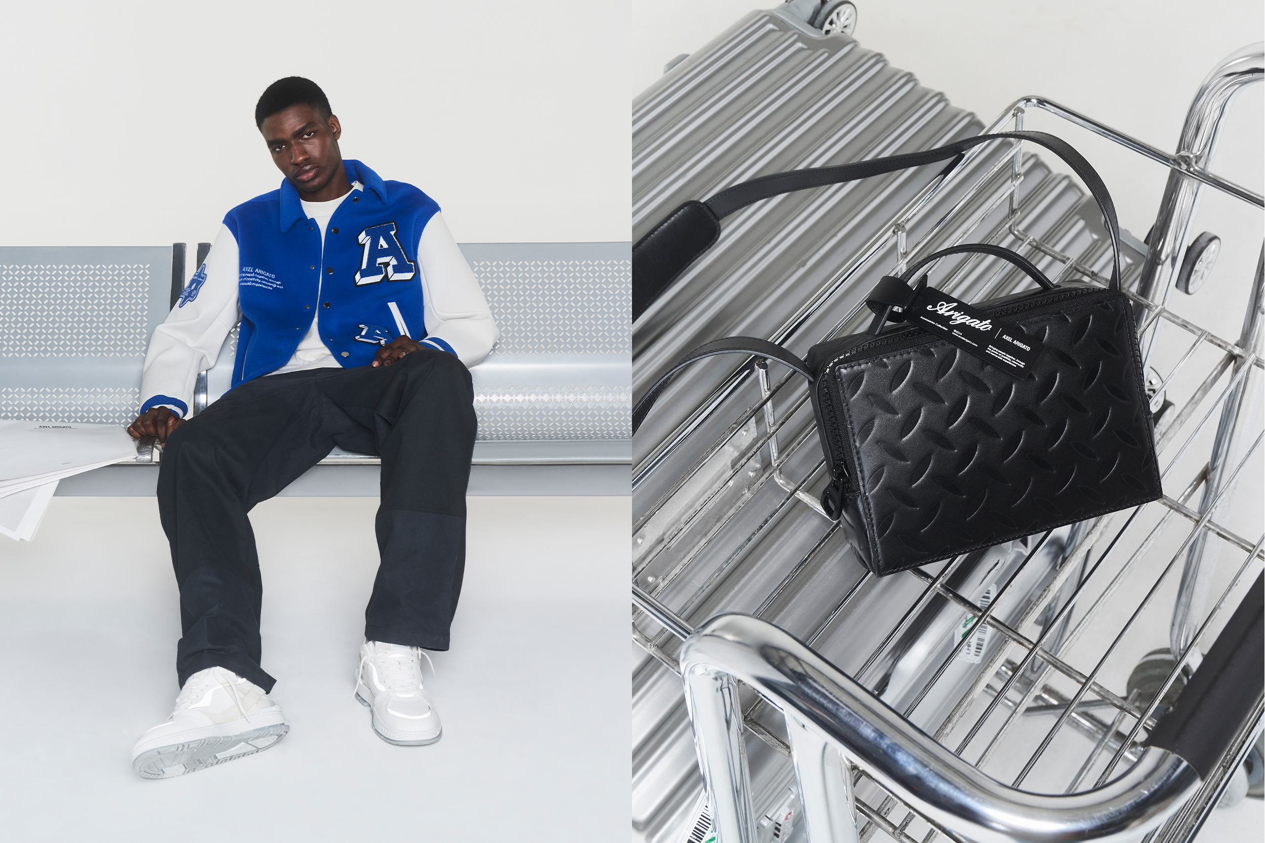
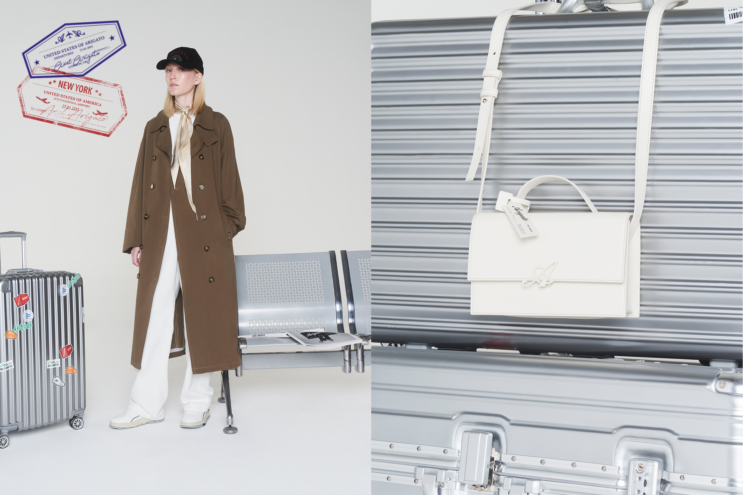
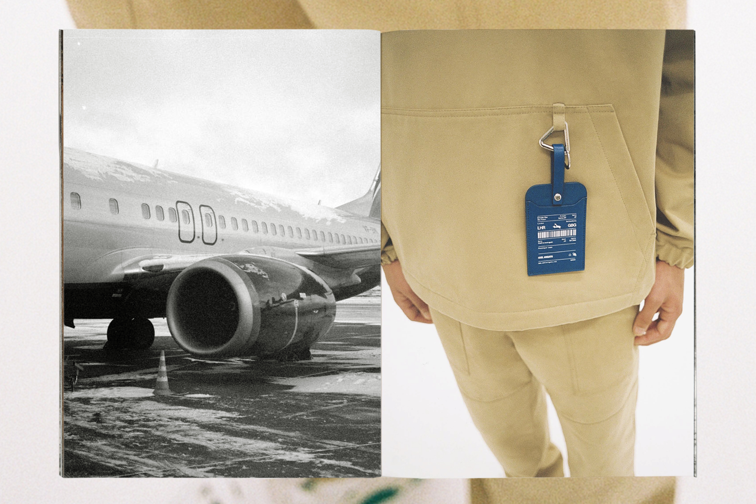
To celebrate our forthcoming season & transition into the US market, for our SS23 collection, we championed the journey across the sea, but creating an aviation inspired direction, based on the subtle narrative of our soon arrival. The imagery was then complimented by a graphic treatment, featuring custom travel stamps which we featured throughout.
Photographer: Antonio Mingot
Art Direction: Nathan Singh
Stylist: Jack Collins
HMU: Chloe Palmer
Set Design: Lottie Toon
Production: Poppy Ashton
Axel Arigato Pre-SS23 Campaign
Art Direction, Graphic Design, CampaignTo celebrate our forthcoming season & transition into the US market, for our SS23 collection, we championed the journey across the sea, but creating an aviation inspired direction, based on the subtle narrative of our soon arrival. The imagery was then complimented by a graphic treatment, featuring custom travel stamps which we featured throughout.
Photographer: Antonio Mingot
Art Direction: Nathan Singh
Stylist: Jack Collins
HMU: Chloe Palmer
Set Design: Lottie Toon
Production: Poppy Ashton
Art Direction: Nathan Singh
Stylist: Jack Collins
HMU: Chloe Palmer
Set Design: Lottie Toon
Production: Poppy Ashton

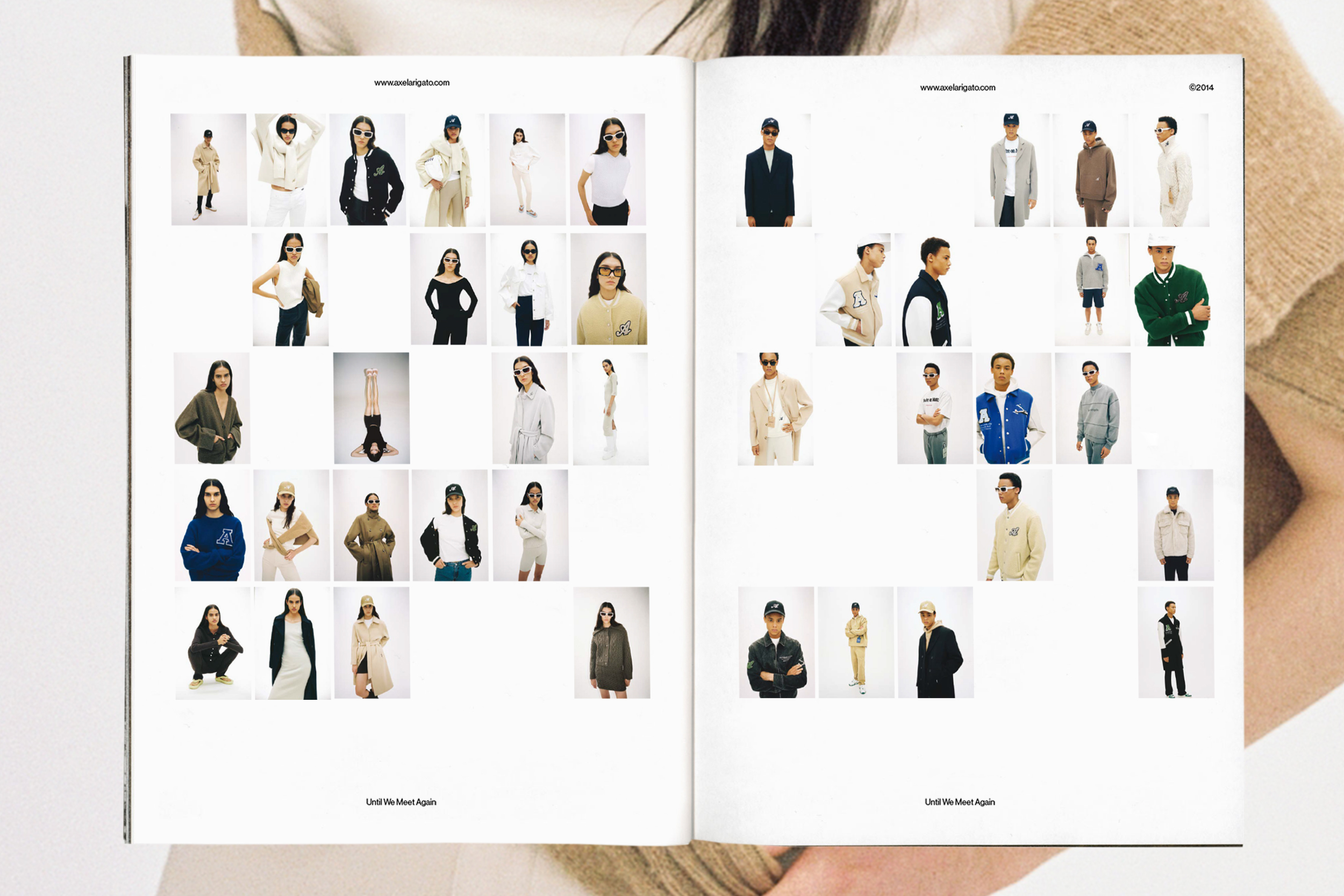
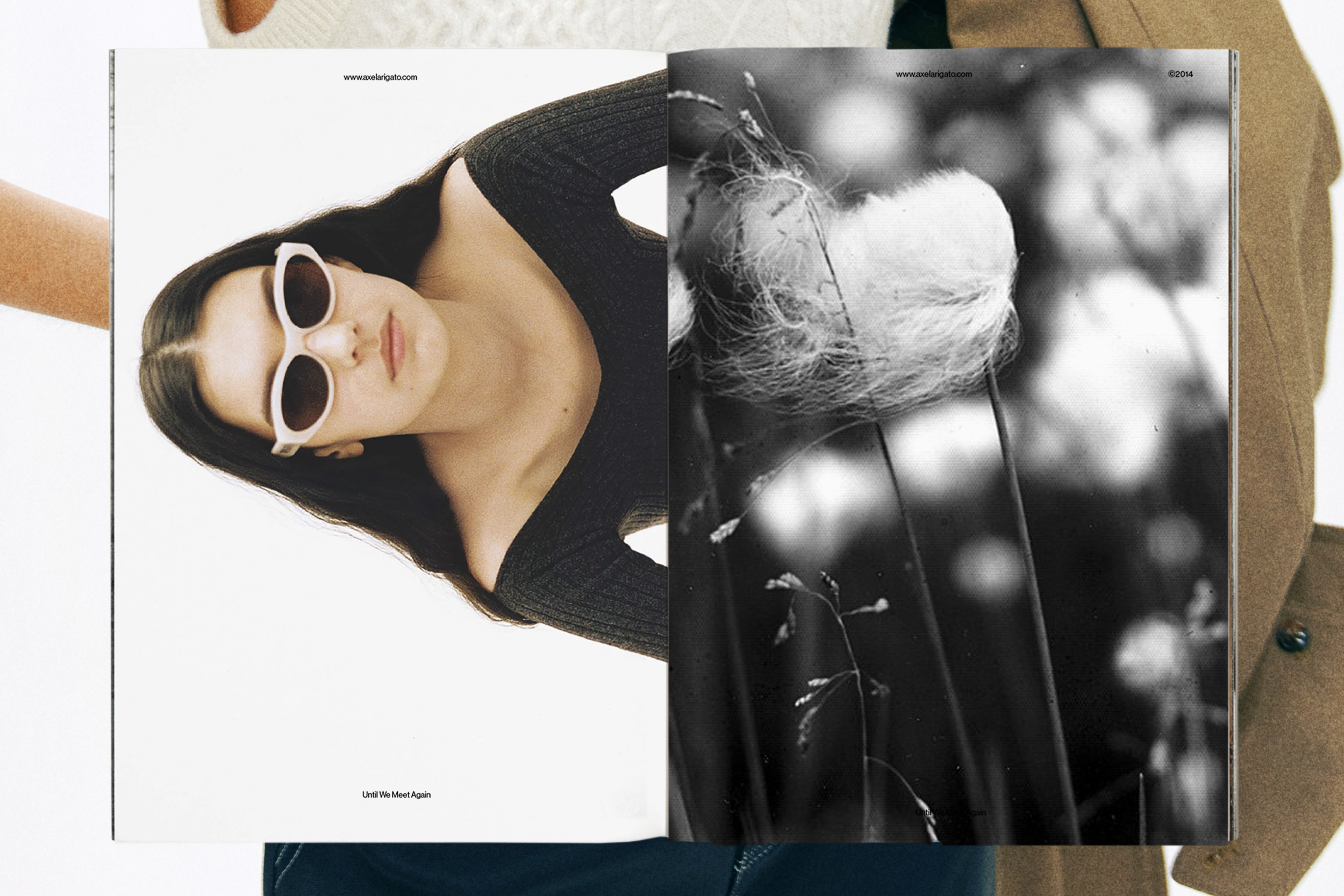
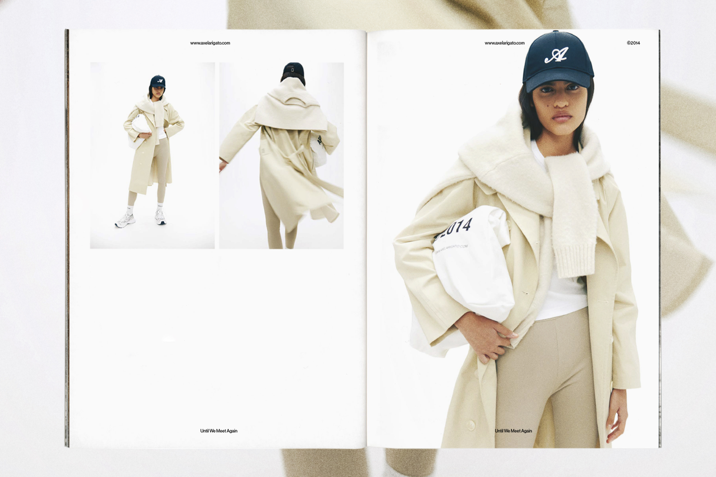
SS23 Printed Lookbook
Art Direction, Print
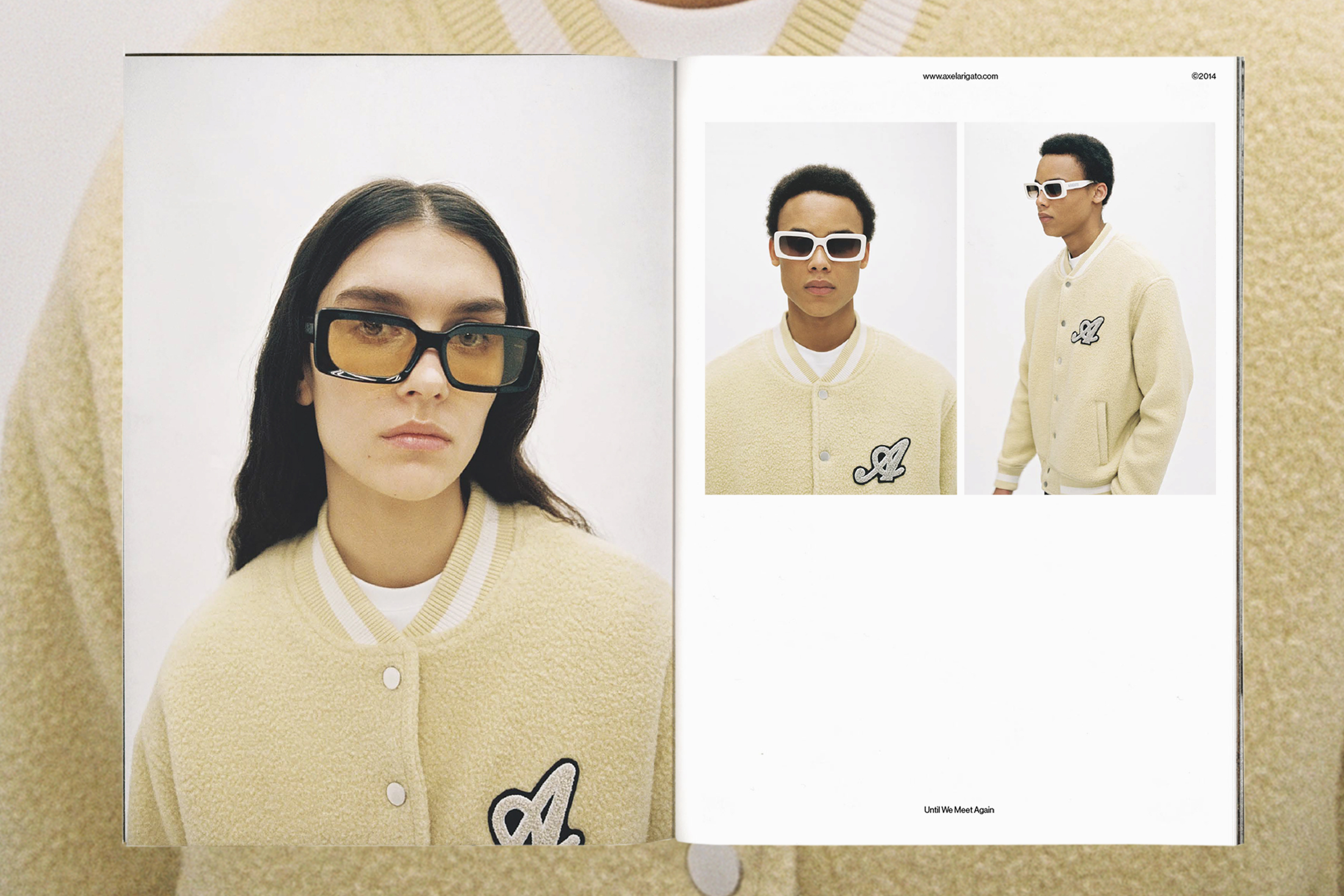
Printed on newspaper print, we created a tactile printed lookbook for our Spring Summer 2023 collection; paying homage to the collection, combining emotive imagery that support narrative through the materials and collection theme, whilst still being considered a functional marketing tool.
Photographer: Linus Morales
Creative Direction: Nathan Singh
Head of RTW: Jens Werner
Print: The Newspaper Club
SS23 Printed Lookbook
Art Direction, PrintPrinted on newspaper print, we created a tactile printed lookbook for our Spring Summer 2023 collection; paying homage to the collection, combining emotive imagery that support narrative through the materials and collection theme, whilst still being considered a functional marketing tool.
Photographer: Linus Morales
Creative Direction: Nathan Singh
Head of RTW: Jens Werner
Print: The Newspaper Club
Creative Direction: Nathan Singh
Head of RTW: Jens Werner
Print: The Newspaper Club
-------
Axel Arigati Valentine’s Day
Art Direction
With the very saturated nature of this seasonal event, we wanted break the mould by approaching stereotypical visual messaging from a different angle. Overseeing the direction throughout, working with an external motion designer to bring expressive forms of 3D through a series of three brand led social posts.
3D Motion: Manuel Bueno
Art Direction: Nathan Singh
Designer/Collabarator: Anna Lura
Head of Creative: Sam Mcwilliams
Axel Arigati Valentine’s Day
Art DirectionWith the very saturated nature of this seasonal event, we wanted break the mould by approaching stereotypical visual messaging from a different angle. Overseeing the direction throughout, working with an external motion designer to bring expressive forms of 3D through a series of three brand led social posts.
3D Motion: Manuel Bueno
Art Direction: Nathan Singh
Designer/Collabarator: Anna Lura
Head of Creative: Sam Mcwilliams
Art Direction: Nathan Singh
Designer/Collabarator: Anna Lura
Head of Creative: Sam Mcwilliams

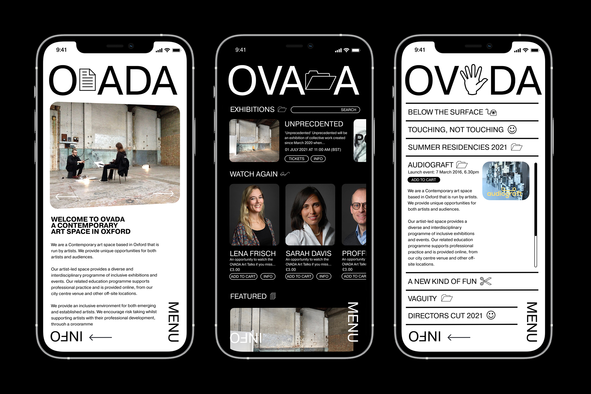
Ovada Oxford [VIEW FULL PROJECT ︎]
Branding, Graphic Design, Digital
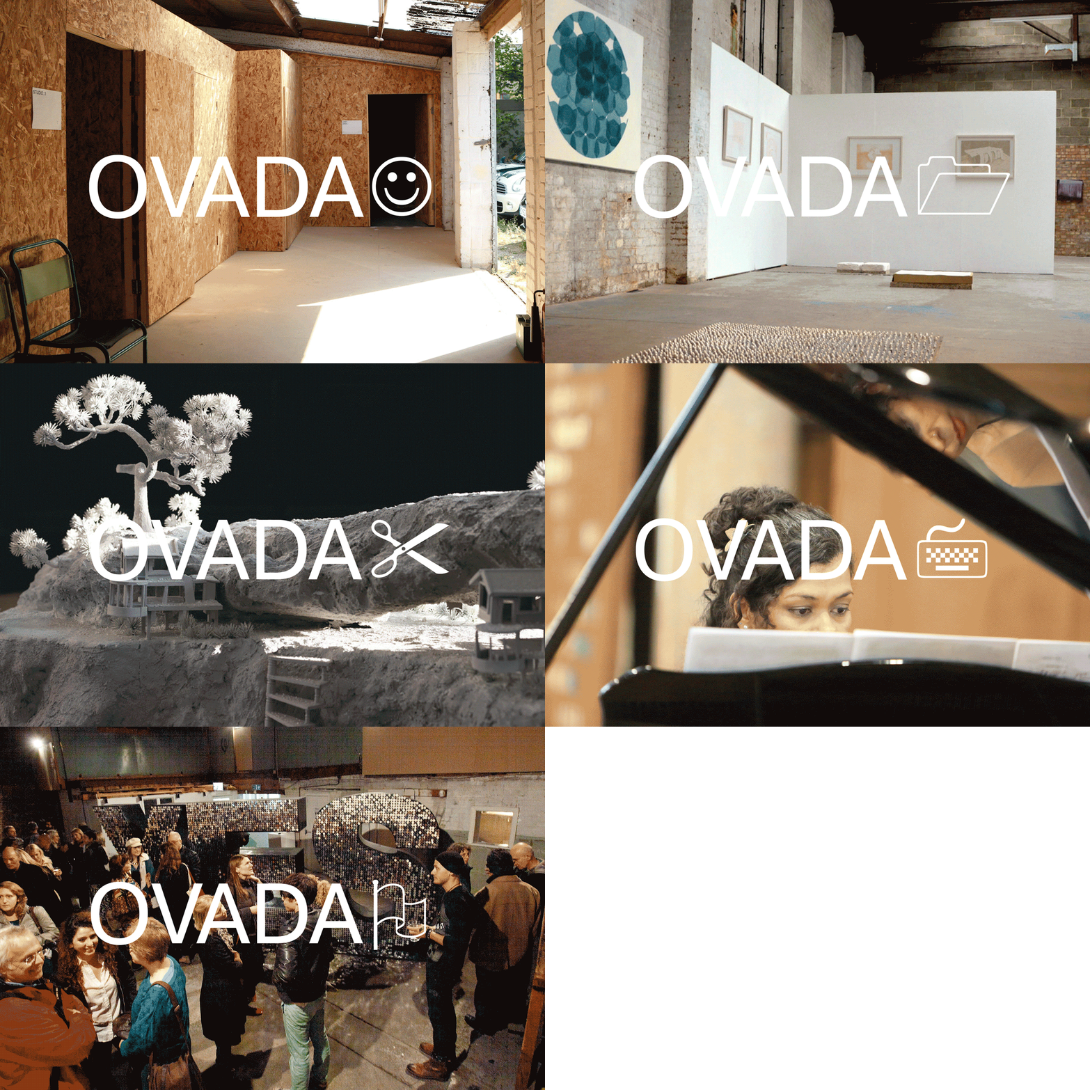
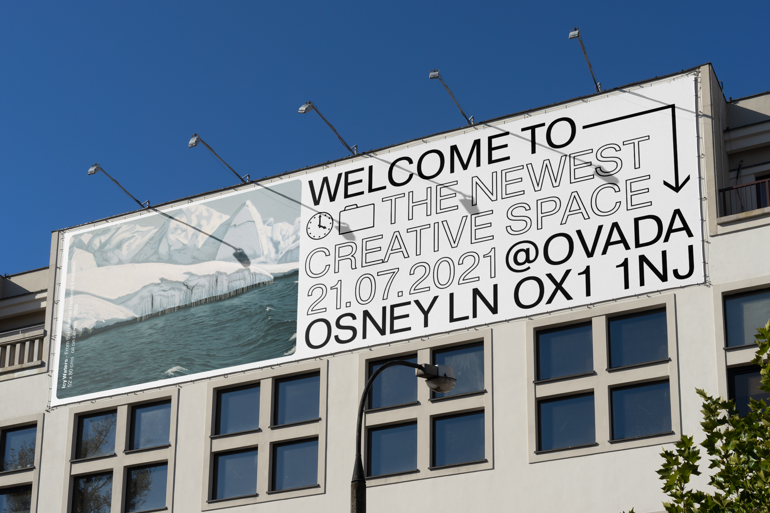
Ovada is a Contemporary multidisciplinary art space based in Oxford exploring unique opportunities for both artists and audiences. Ovada provides an inclusive environment for both emerging and established artists and brings to life, the world of local modern art. Keeping modernism at the heart of the branding, taking a otherwise traditional typeface (wingdings) and weaving this into a practical, yet visual, informative tool for wayfinding and expression.
Ovada Oxford [VIEW FULL PROJECT ︎]
Branding, Graphic Design, DigitalOvada is a Contemporary multidisciplinary art space based in Oxford exploring unique opportunities for both artists and audiences. Ovada provides an inclusive environment for both emerging and established artists and brings to life, the world of local modern art. Keeping modernism at the heart of the branding, taking a otherwise traditional typeface (wingdings) and weaving this into a practical, yet visual, informative tool for wayfinding and expression.
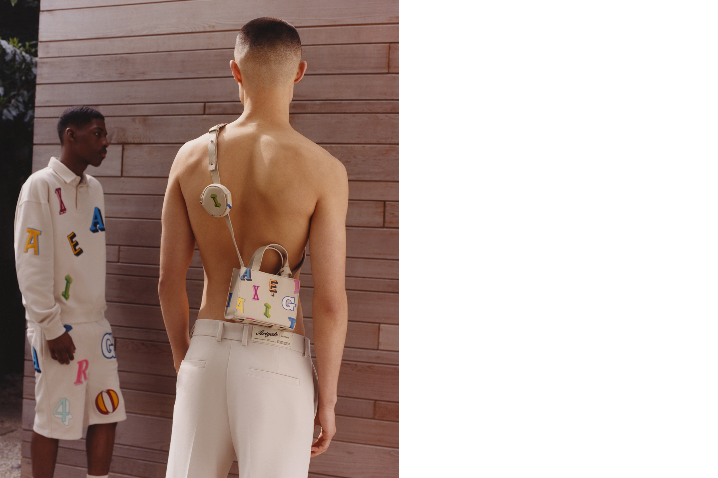
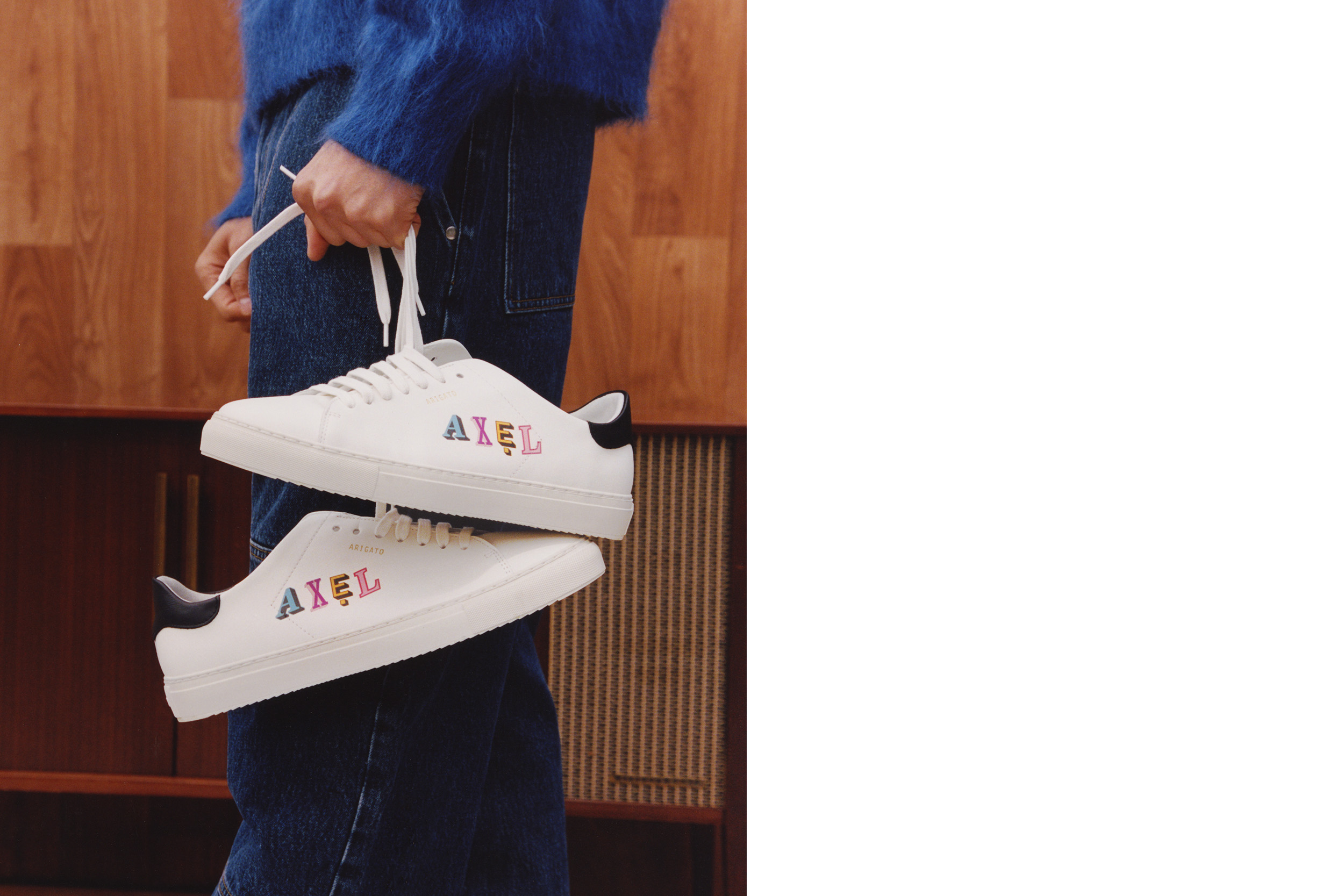


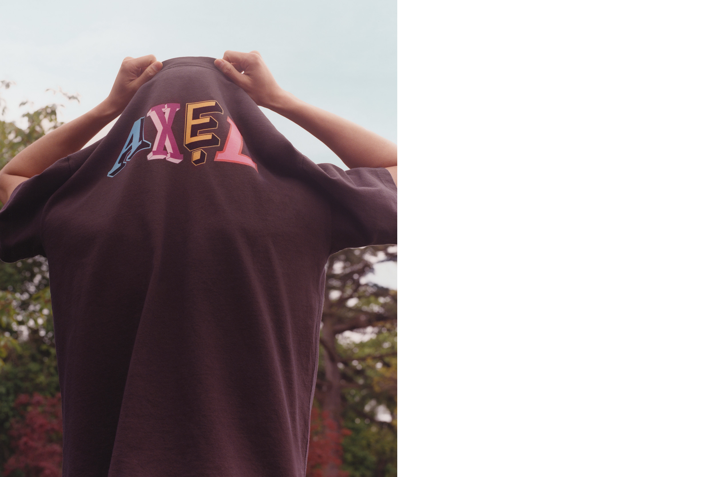

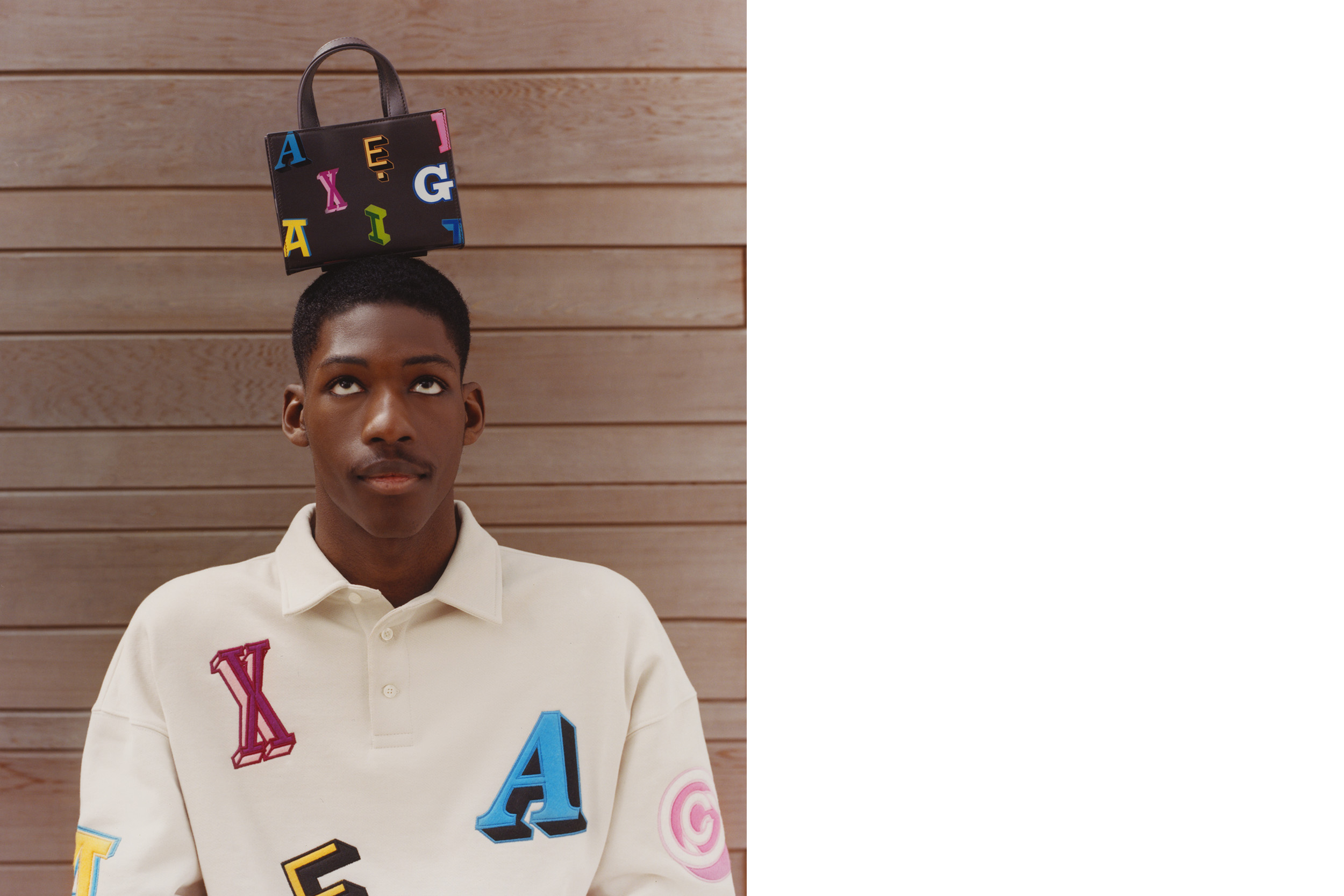
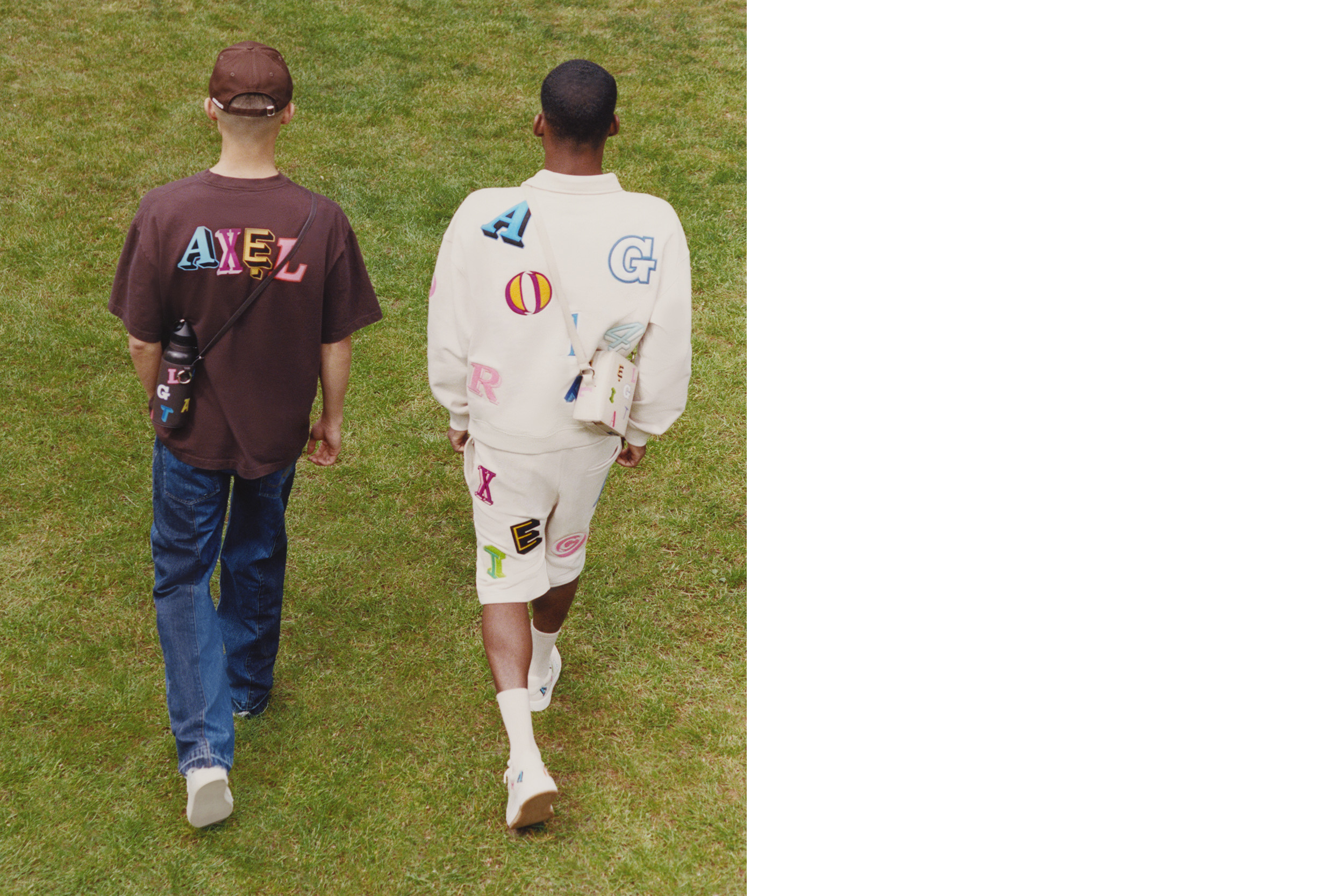
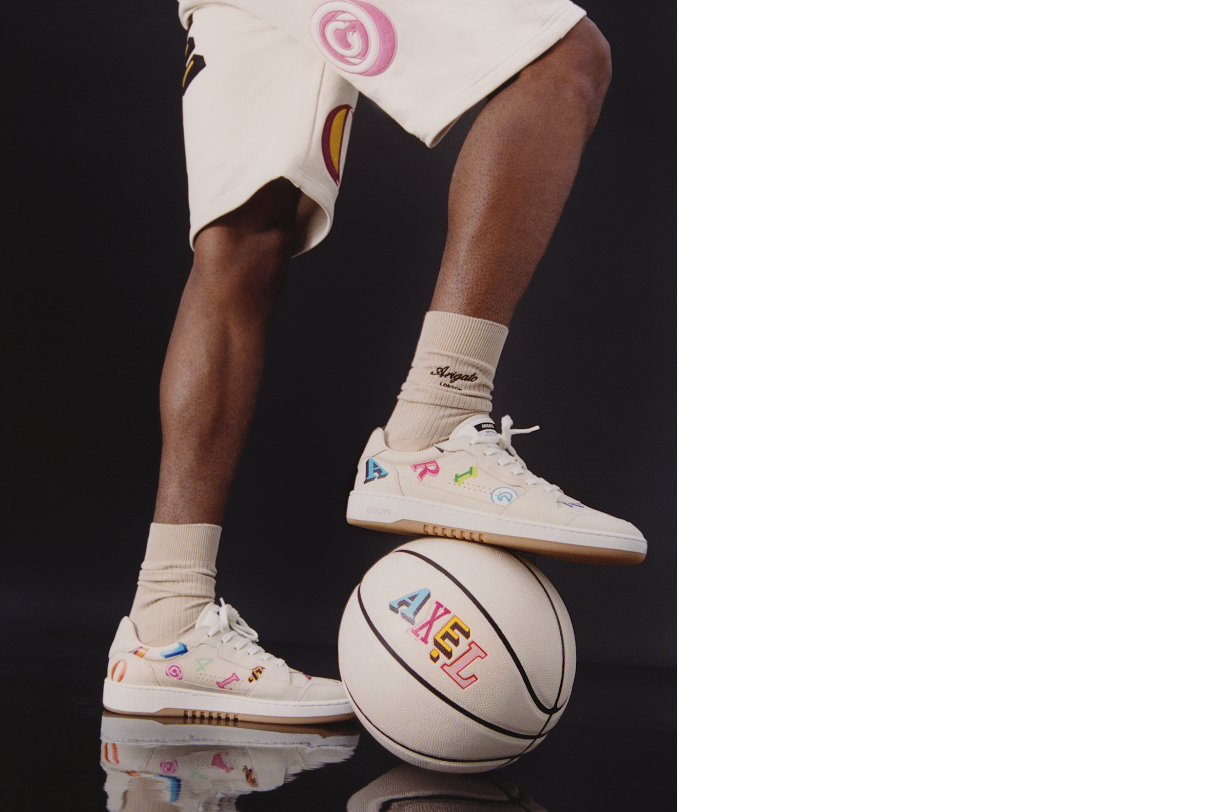
Axel Arigato Monogram Capsule Collection
Direction, Graphic Design
Under the direction of the Head of RTW, creating a full monogram with the design team for one of our seasonal capsule collections. Celebrating the brands short, yet broad history, we visited a range of previous archive fonts, taking a range of letterforms to construct a fresh design. Inspired by the collection itself and the ideologies of the ‘past’, bringing a classic, yet timeless feel throughout imagery & grade to support the graphics.
Head of RTW: Jens Werner
Graphics: Nathan Singh
Photographer: Rachel Lamb
On-set AD: Alba Susagna
Styling: Jake Hunte
HMU: Grace Sinnott
Axel Arigato Monogram Capsule Collection
Direction, Graphic DesignUnder the direction of the Head of RTW, creating a full monogram with the design team for one of our seasonal capsule collections. Celebrating the brands short, yet broad history, we visited a range of previous archive fonts, taking a range of letterforms to construct a fresh design. Inspired by the collection itself and the ideologies of the ‘past’, bringing a classic, yet timeless feel throughout imagery & grade to support the graphics.
Head of RTW: Jens Werner
Graphics: Nathan Singh
Photographer: Rachel Lamb
On-set AD: Alba Susagna
Styling: Jake Hunte
HMU: Grace Sinnott
Graphics: Nathan Singh
Photographer: Rachel Lamb
On-set AD: Alba Susagna
Styling: Jake Hunte
HMU: Grace Sinnott
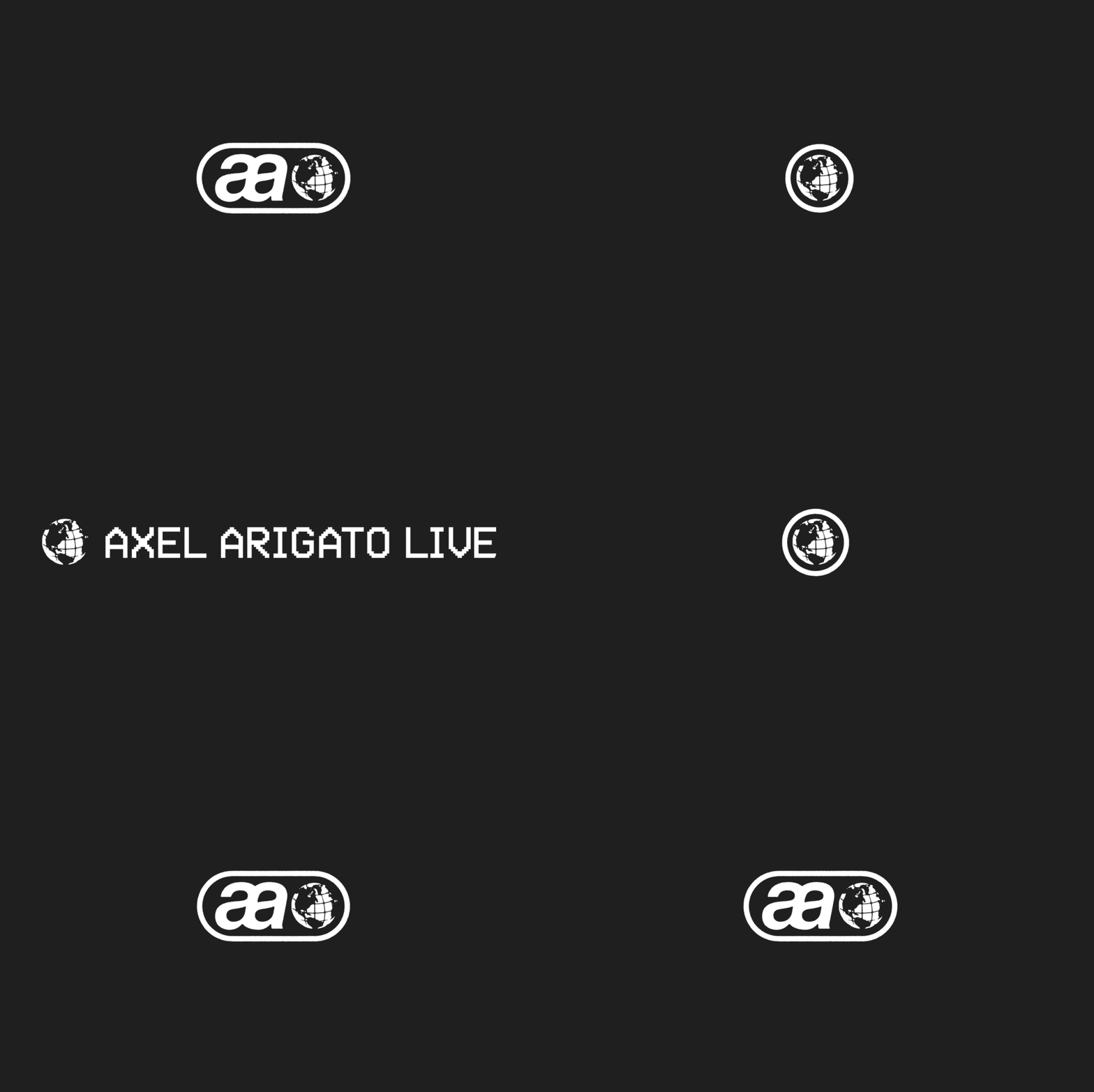


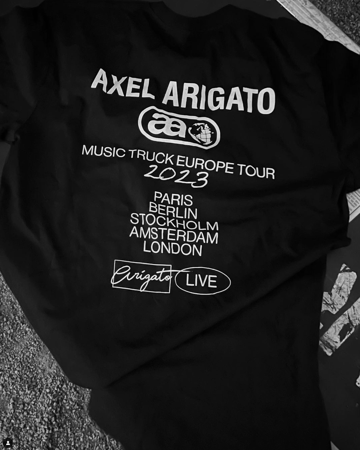
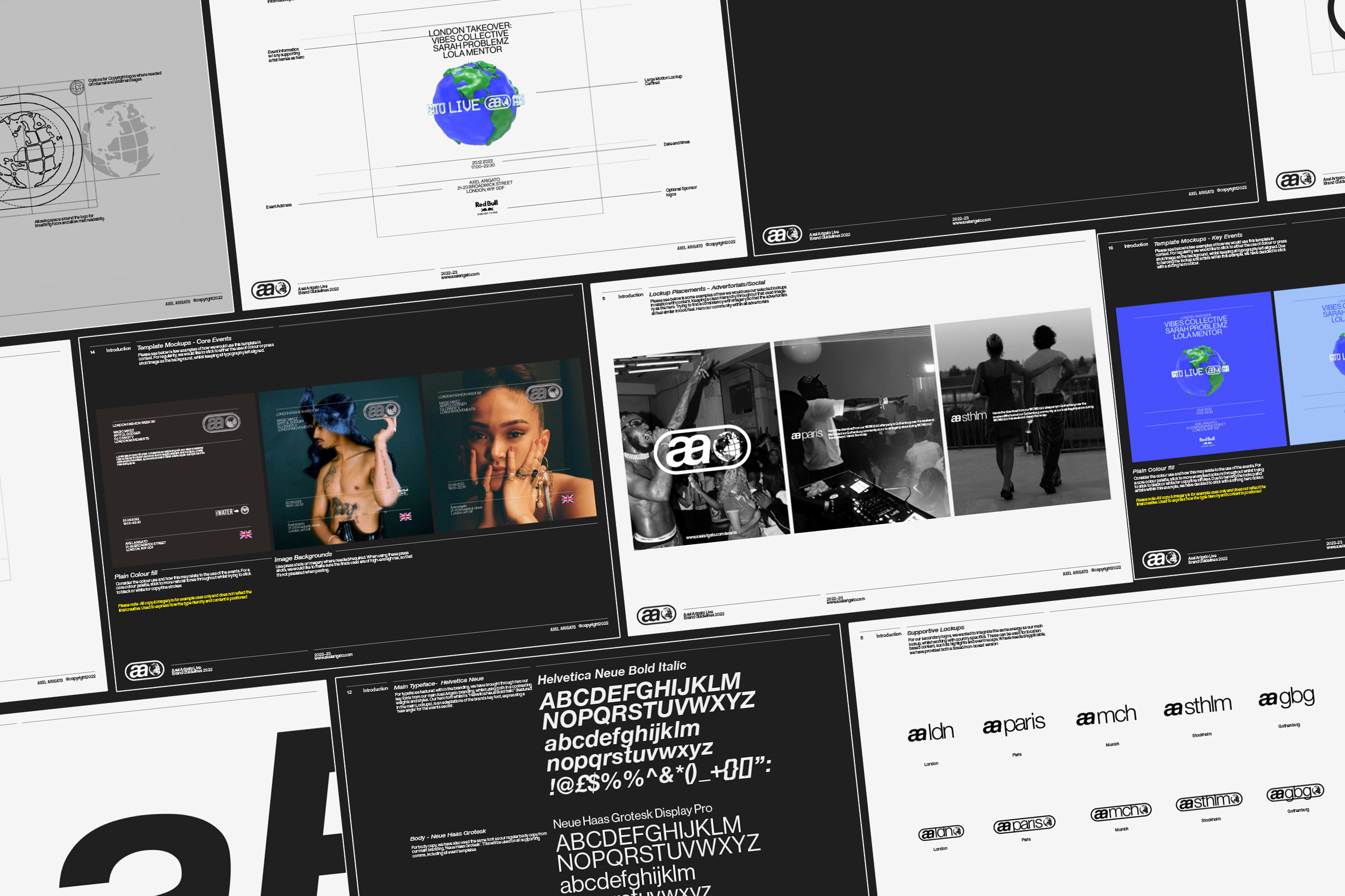
AALive Rebranding 2023 [VIEW FULL PROJECT ︎]
Identity, Branding, Campaign, Image Direction
Axel Arigato’s event sector has vasty become a growing part of the brands DNA, holding multiple events a week, across a wide range of countries around the world. As part of a solo-initiative project, explorting a full refresh of the brands visual identity, bringing a crisp, on-brand approach to the design which as spoke to our market audience. Taking inspiration from classic 90s MTV idents & radio atheistic, AALive acts as the home for all Axel Arigato event across the globe, taking smaller design neurones, such as type choice from our main brand - calling to its younger, youthful audience demographic.
Typeface : Neue Haas Grotesk
Motion/3D Design: Charlie Jefferries
AALive Rebranding 2023 [VIEW FULL PROJECT ︎]
Identity, Branding, Campaign, Image DirectionAxel Arigato’s event sector has vasty become a growing part of the brands DNA, holding multiple events a week, across a wide range of countries around the world. As part of a solo-initiative project, explorting a full refresh of the brands visual identity, bringing a crisp, on-brand approach to the design which as spoke to our market audience. Taking inspiration from classic 90s MTV idents & radio atheistic, AALive acts as the home for all Axel Arigato event across the globe, taking smaller design neurones, such as type choice from our main brand - calling to its younger, youthful audience demographic.
Typeface : Neue Haas Grotesk
Motion/3D Design: Charlie Jefferries
Motion/3D Design: Charlie Jefferries
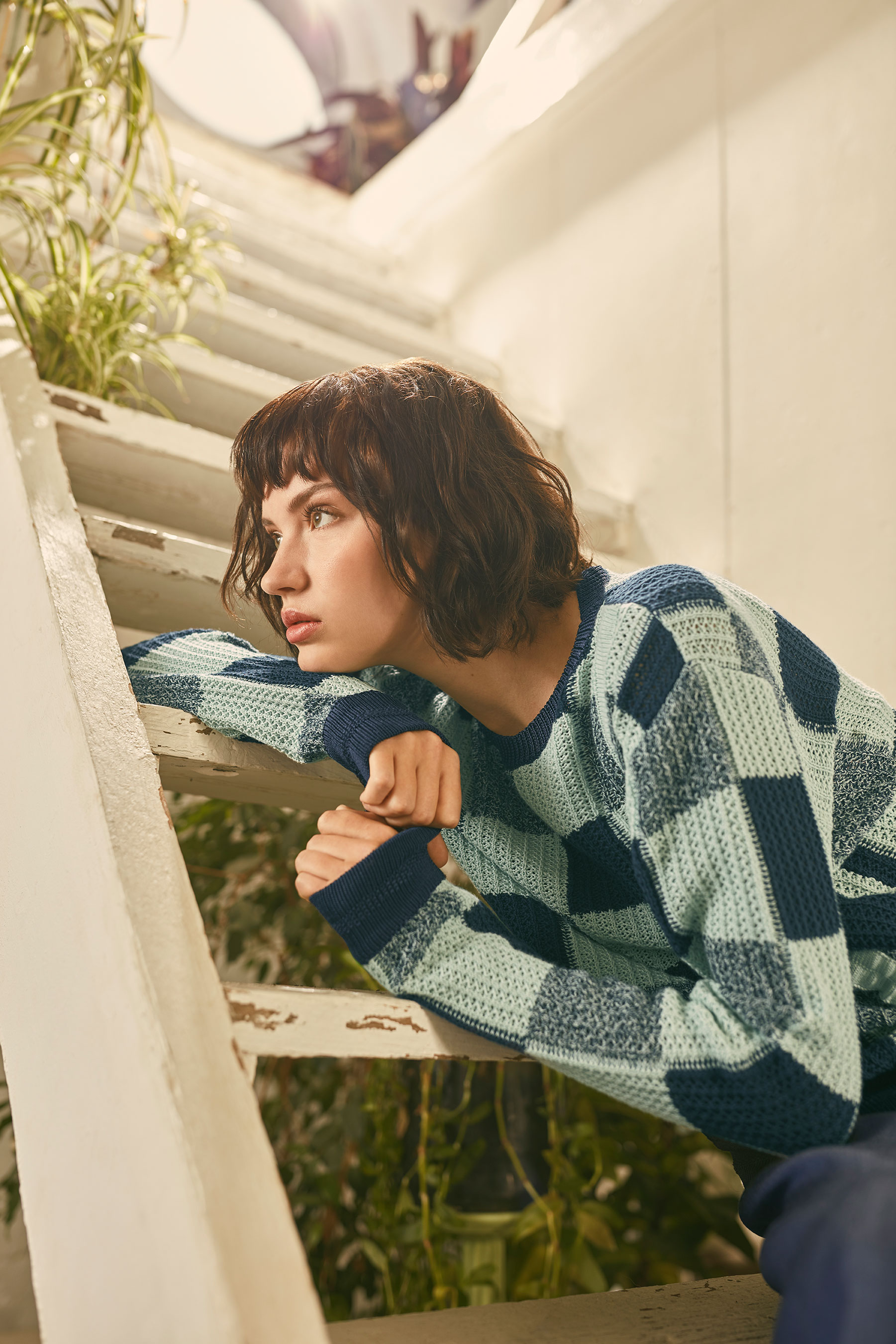
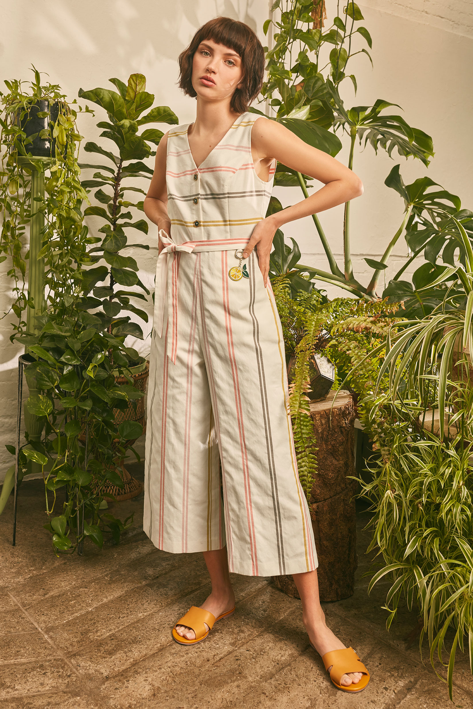
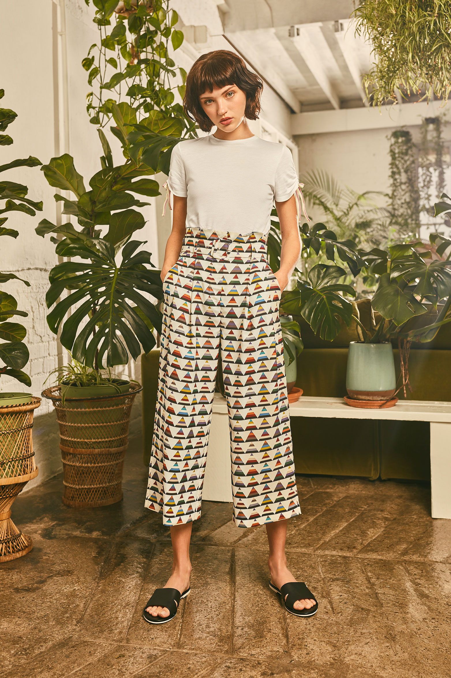

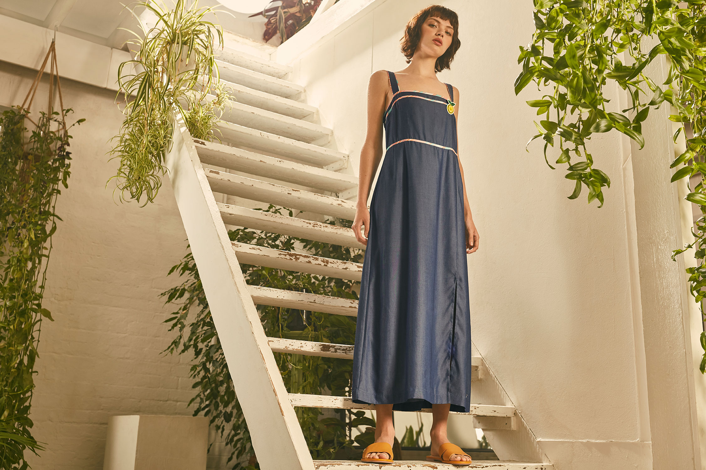
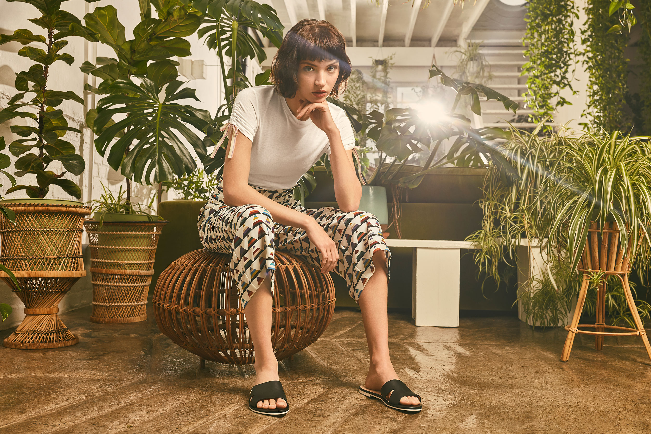
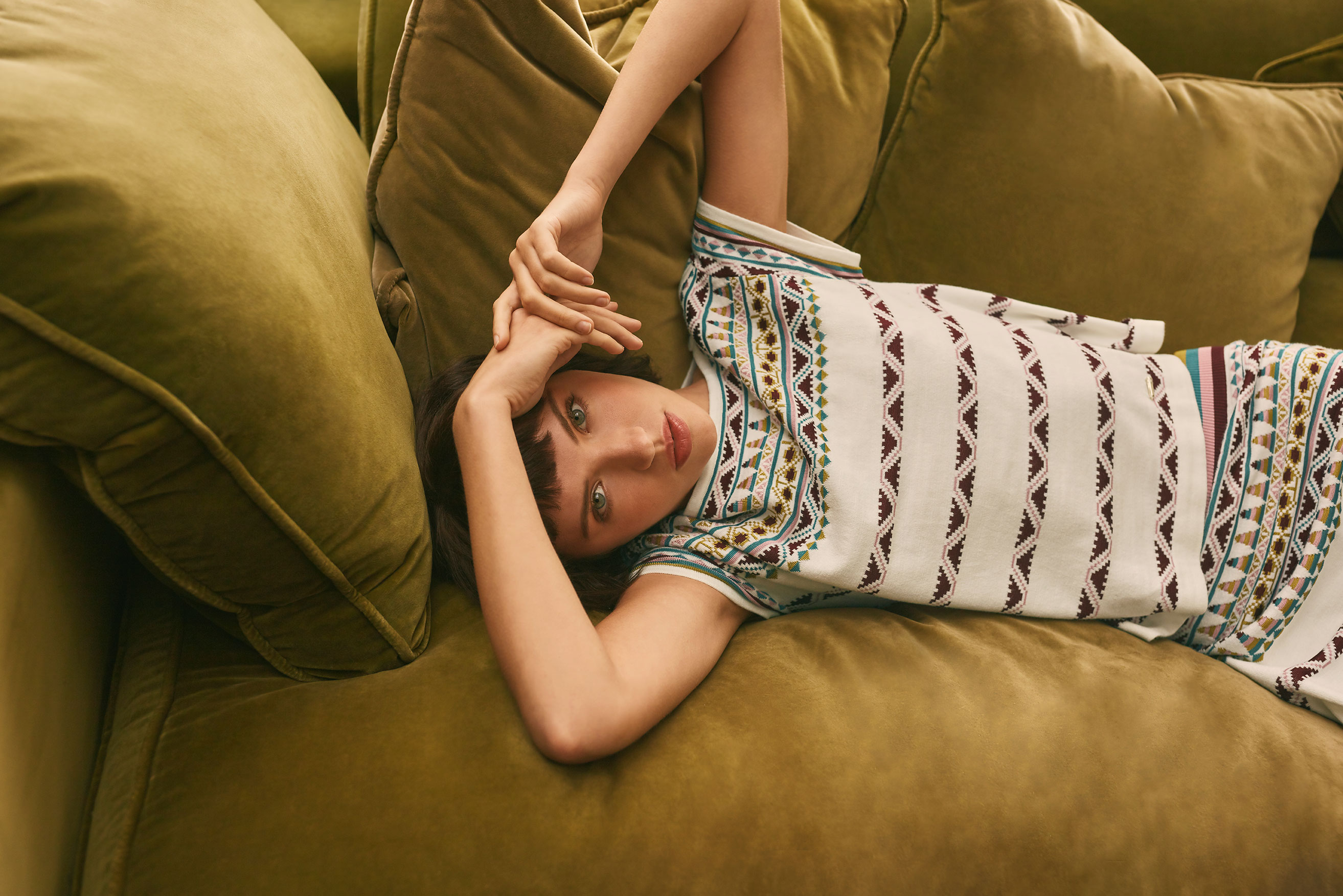
Ted Baker’s SS20 ‘Colour By Number’s Capsule
Art Direction, Campaign
A sub-collection for a more youthful and expressive customer, breaking the traditional floral textures Ted Baker are use too. Launching in the Spring Summer season, bringing a fresh, midsummer feel throughout, whilst taking a ode to these icon floral designs and ‘spotlighting’ a fresh direction for the brand.
Photographer: Simon Lesley
Art Direction: Nathan Singh
Styling: Emma Townsend
Make up: Kenny Leung
Hair: Michela Olivieri
Ted Baker’s SS20 ‘Colour By Number’s Capsule
Art Direction, CampaignA sub-collection for a more youthful and expressive customer, breaking the traditional floral textures Ted Baker are use too. Launching in the Spring Summer season, bringing a fresh, midsummer feel throughout, whilst taking a ode to these icon floral designs and ‘spotlighting’ a fresh direction for the brand.
Photographer: Simon Lesley
Art Direction: Nathan Singh
Styling: Emma Townsend
Make up: Kenny Leung
Hair: Michela Olivieri
Art Direction: Nathan Singh
Styling: Emma Townsend
Make up: Kenny Leung
Hair: Michela Olivieri


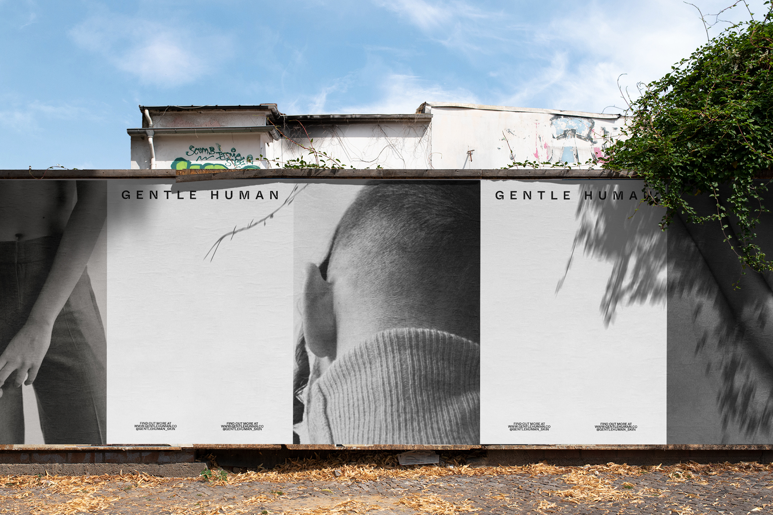
Gentle Human: Skincare For all [VIEW FULL PROJECT ︎]
Branding, Graphic Design, Concept
Born out of frustration, when looking, learning and recommending products to look after skin, there was not a go-to brand for men. There was not a skincare brand that really spoke to the modern man or took a holistic approach to men’s self-care. Paying direct homage to these imperfections through design styles, typography impurities and inclusive campaign concepts. This is a growing project and more to be developed over 2024.
Client: Jess Anastasi & Benjamin Ottieno (Founders)
Typeface: ABC Whyte Inktrap Medium
Gentle Human: Skincare For all [VIEW FULL PROJECT ︎]
Branding, Graphic Design, ConceptBorn out of frustration, when looking, learning and recommending products to look after skin, there was not a go-to brand for men. There was not a skincare brand that really spoke to the modern man or took a holistic approach to men’s self-care. Paying direct homage to these imperfections through design styles, typography impurities and inclusive campaign concepts. This is a growing project and more to be developed over 2024.
Client: Jess Anastasi & Benjamin Ottieno (Founders)
Typeface: ABC Whyte Inktrap Medium
Typeface: ABC Whyte Inktrap Medium

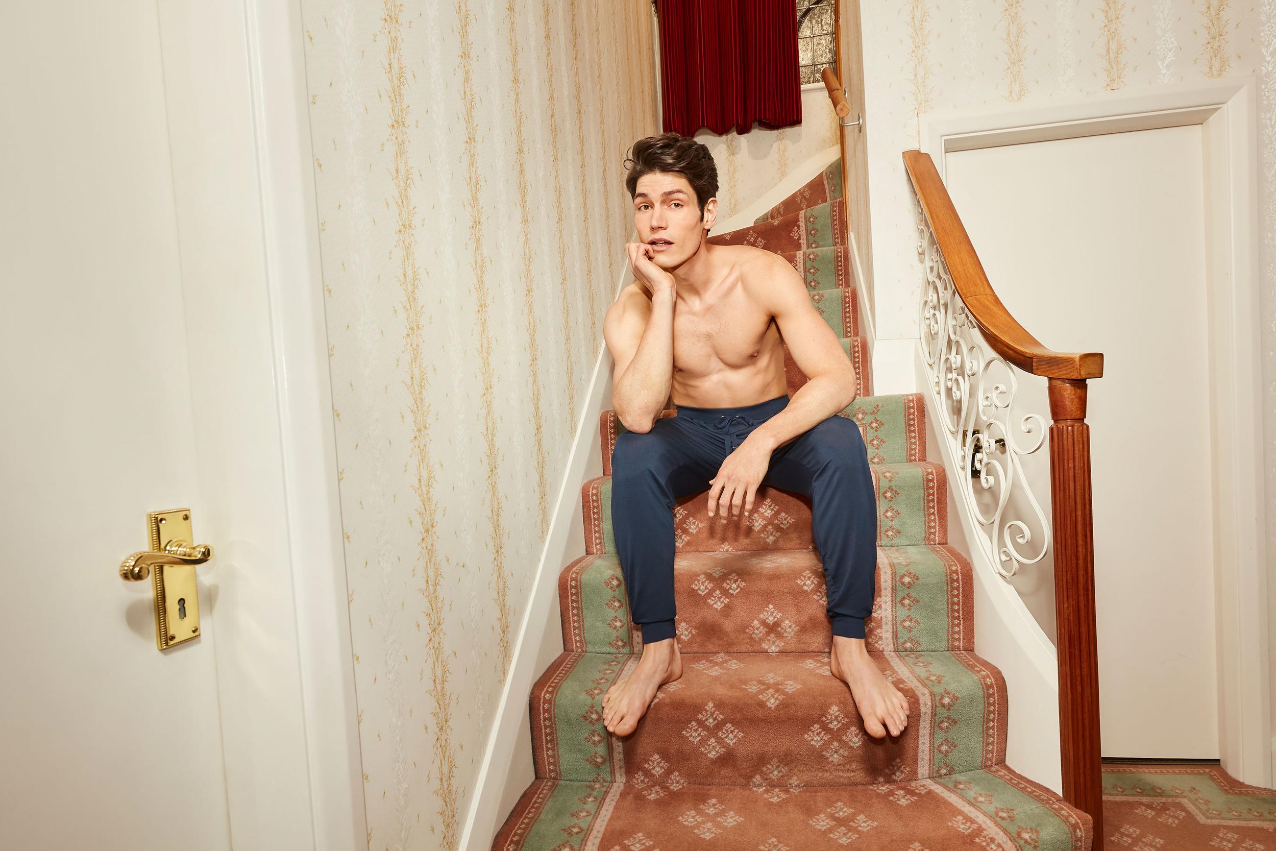

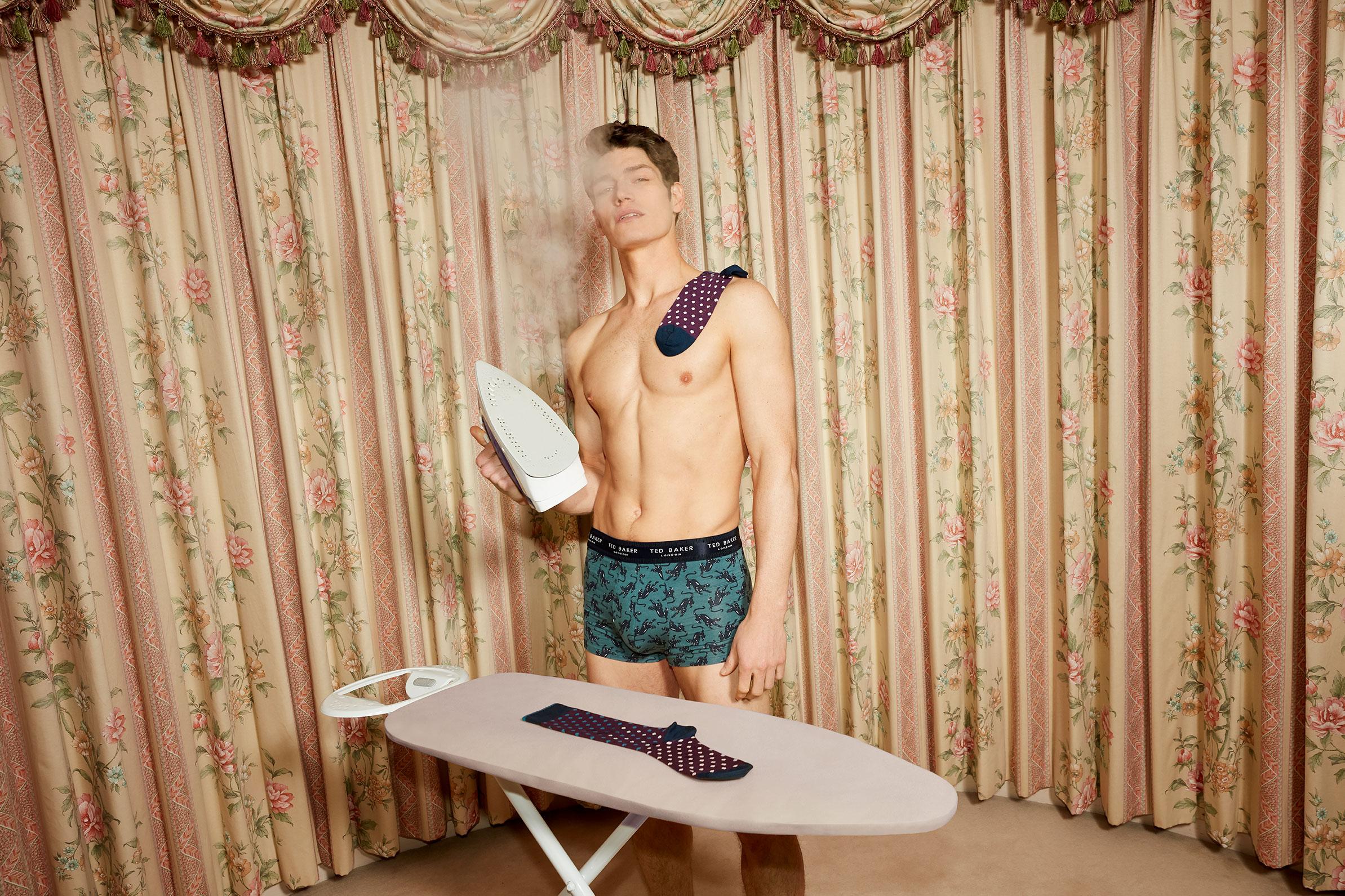
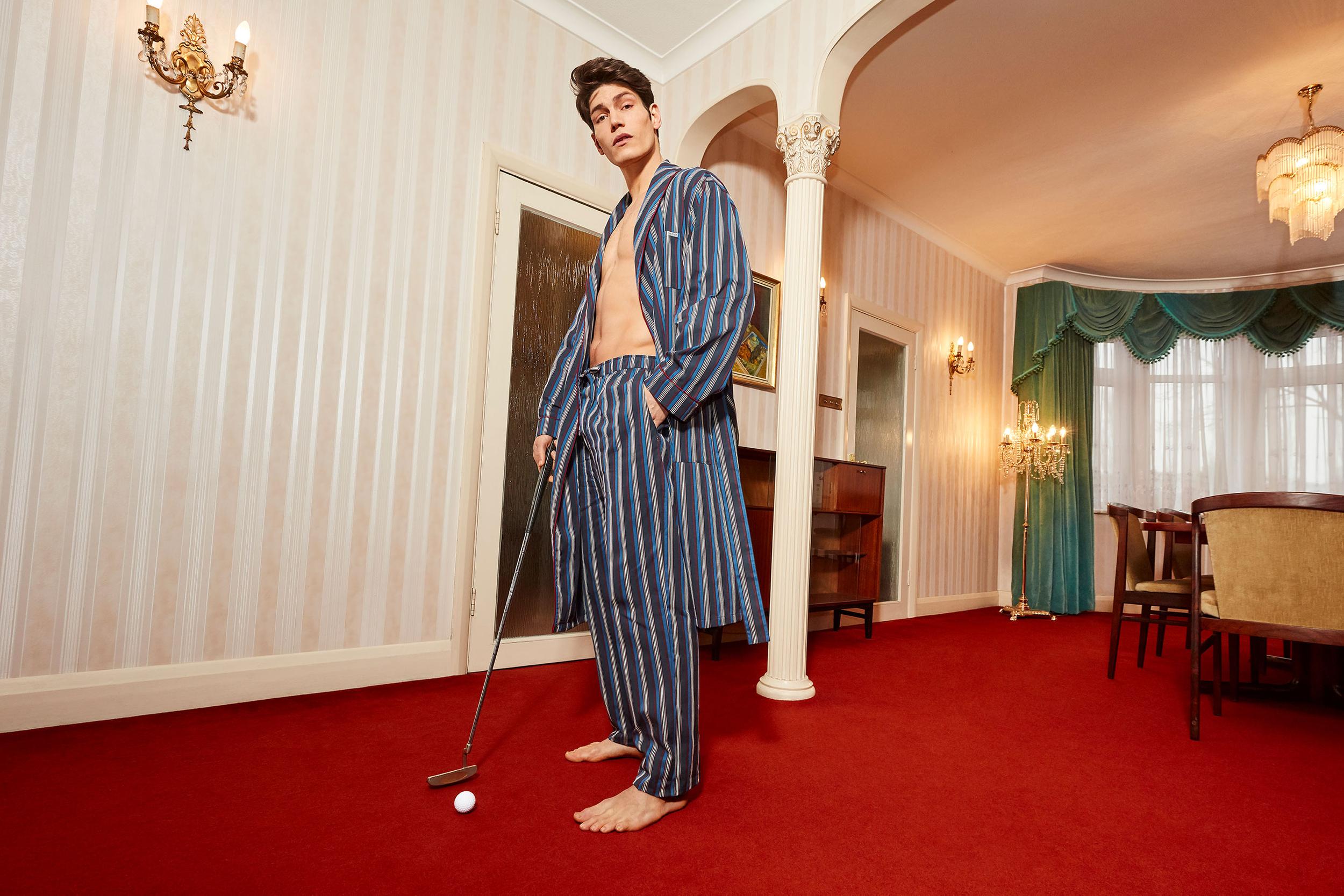
Ted’s Always Got You Covered
Art Direction, Campaign
Inspired by the 1983 Movie Risky Business’ classic underwear dance scene, providing the notion that Ted Baker has you covered for those ‘Home-Alone’ parties. A fun & playful take on individuality, showing that you can be anything and do anything, in a good pair of comfortable briefs. Featuring British Singer-Songwriter, Sam Ways
Photographer: Simon Lesley
Lighting: Liam Young
Art Direction: Nathan Singh
Lead Creative: Zoe Lines
Styling: Maddison J
Styling Assistant: Bethany Knight
HMU: Kenny Leung
Ted’s Always Got You Covered
Art Direction, CampaignInspired by the 1983 Movie Risky Business’ classic underwear dance scene, providing the notion that Ted Baker has you covered for those ‘Home-Alone’ parties. A fun & playful take on individuality, showing that you can be anything and do anything, in a good pair of comfortable briefs. Featuring British Singer-Songwriter, Sam Ways
Photographer: Simon Lesley
Lighting: Liam Young
Art Direction: Nathan Singh
Lead Creative: Zoe Lines
Styling: Maddison J
Styling Assistant: Bethany Knight
HMU: Kenny Leung
Lighting: Liam Young
Art Direction: Nathan Singh
Lead Creative: Zoe Lines
Styling: Maddison J
Styling Assistant: Bethany Knight
HMU: Kenny Leung



Reciprocal Recollection (ISTD Student Award Winner 2016)
Editorial, Print
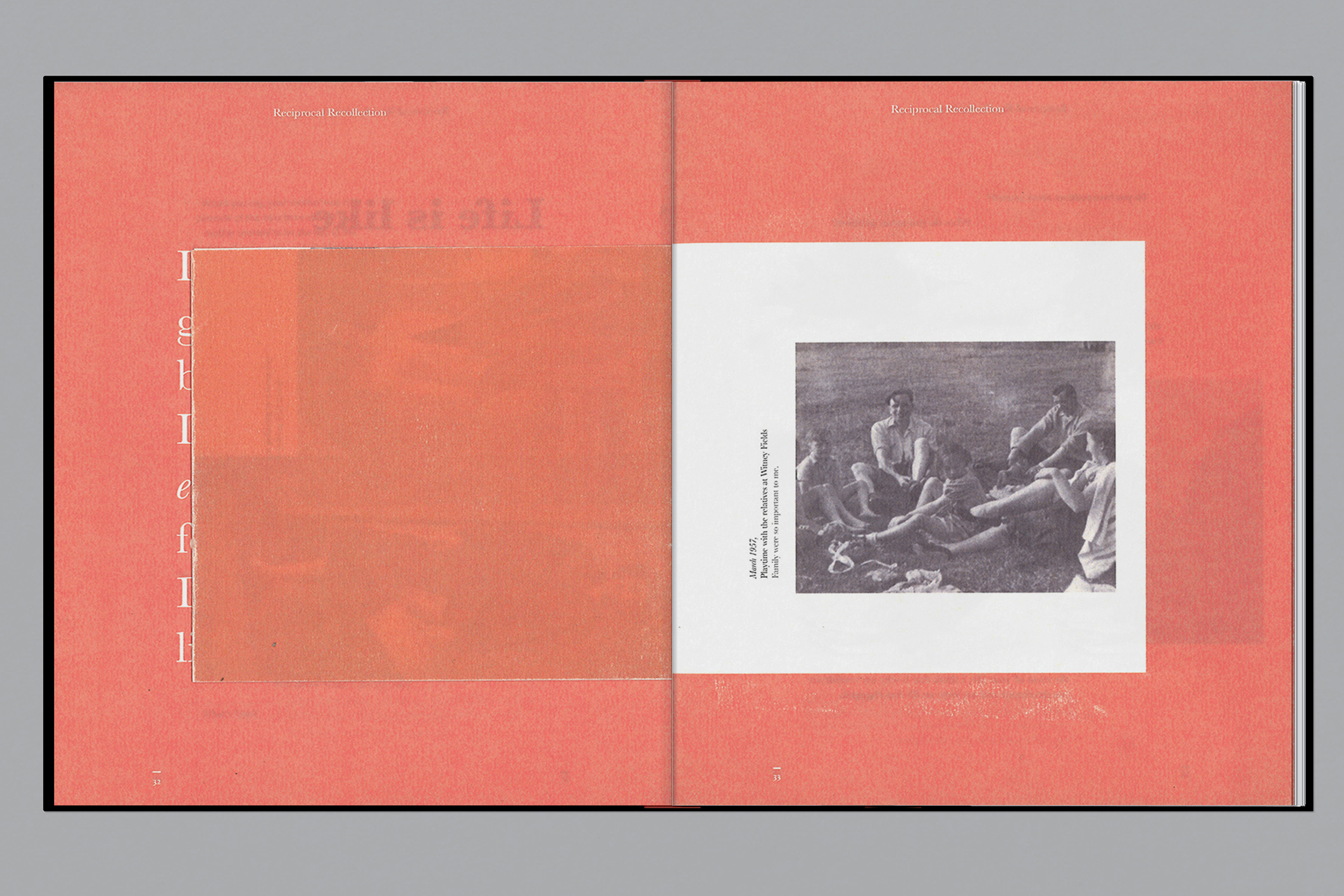
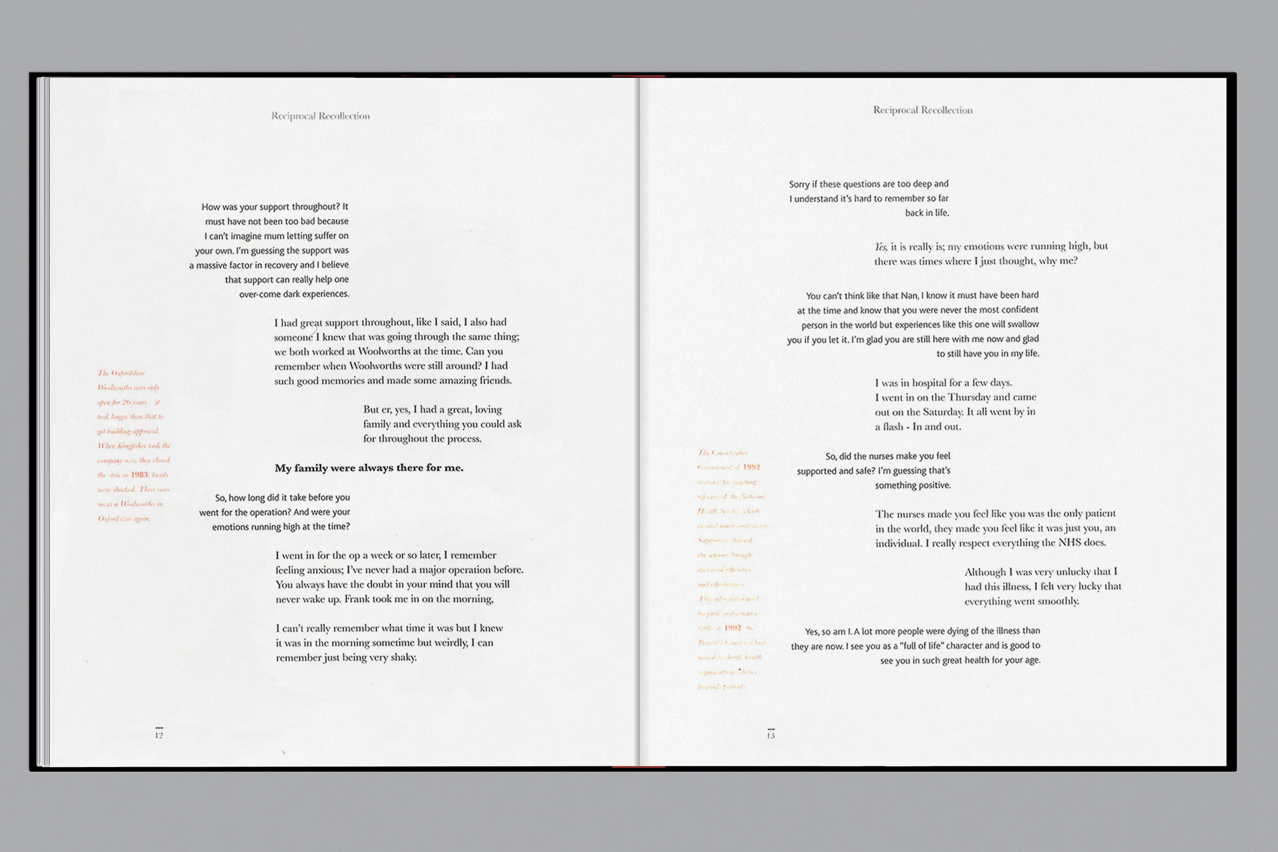
Exposure to the unknown can scare and overwhelm us. Although losing someone is indescribable and irreversible, it forces an individual to adapt and change. Attitude towards loss defines how we live, and how we learn from our experience shapes how we grow. Reciprocal Recollection is a dialog between myself and my inspirational Grandmother. Speaking about her life/death experiences, the editorial explores the use of typography as a protagonist for emotion, drawing them into the conversation between two parties.
Typeface: Baskervile/Neue Haas
Photography: Nathan Singh
Awards: ISTD Student Award Winner
Reciprocal Recollection (ISTD Student Award Winner 2016)
Editorial, PrintExposure to the unknown can scare and overwhelm us. Although losing someone is indescribable and irreversible, it forces an individual to adapt and change. Attitude towards loss defines how we live, and how we learn from our experience shapes how we grow. Reciprocal Recollection is a dialog between myself and my inspirational Grandmother. Speaking about her life/death experiences, the editorial explores the use of typography as a protagonist for emotion, drawing them into the conversation between two parties.
Typeface: Baskervile/Neue Haas
Photography: Nathan Singh
Awards: ISTD Student Award Winner
Photography: Nathan Singh
Awards: ISTD Student Award Winner

The Flocculent Transition, Dreamingless
Photography, Art Direction
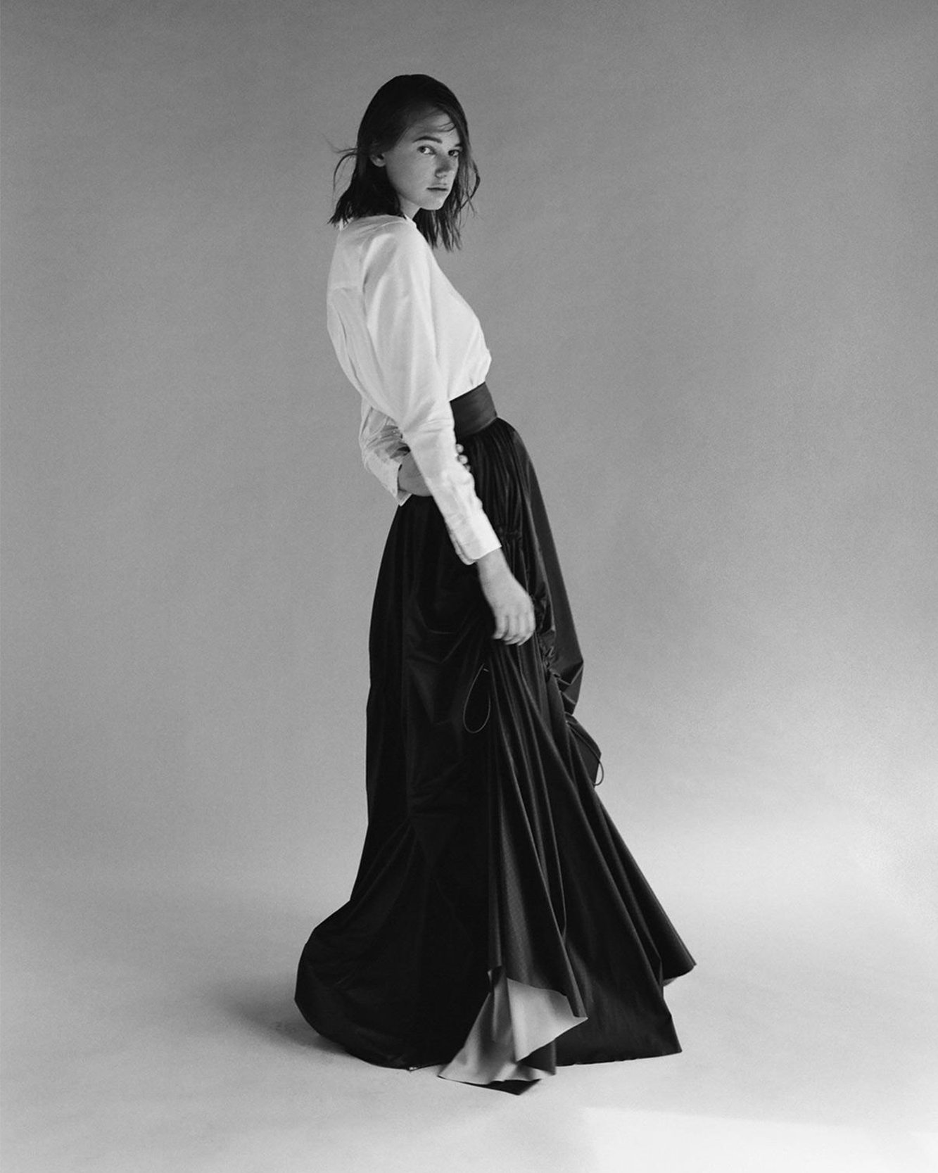
“A selection of imagery from a series produced for Dreamingless magazine. Stepping through a transition of flocculent variation whilst adapting a rich withdrawal from our current surroundings. Fashioning a euphoric dwelling with matters of change through subliminal lighting that gestures transformation within our current culture”. - Dreamingless
Photography: Nathan Singh
Lighting: Liam Young
Art Direction: Nathan Singh
Styling: Phoebe Brannick
Hair Stylist: Christopher Gatt
Make up Artist: Kenny Leung
The Flocculent Transition, Dreamingless
Photography, Art Direction“A selection of imagery from a series produced for Dreamingless magazine. Stepping through a transition of flocculent variation whilst adapting a rich withdrawal from our current surroundings. Fashioning a euphoric dwelling with matters of change through subliminal lighting that gestures transformation within our current culture”. - Dreamingless
Photography: Nathan Singh
Lighting: Liam Young
Art Direction: Nathan Singh
Styling: Phoebe Brannick
Hair Stylist: Christopher Gatt
Make up Artist: Kenny Leung
Lighting: Liam Young
Art Direction: Nathan Singh
Styling: Phoebe Brannick
Hair Stylist: Christopher Gatt
Make up Artist: Kenny Leung


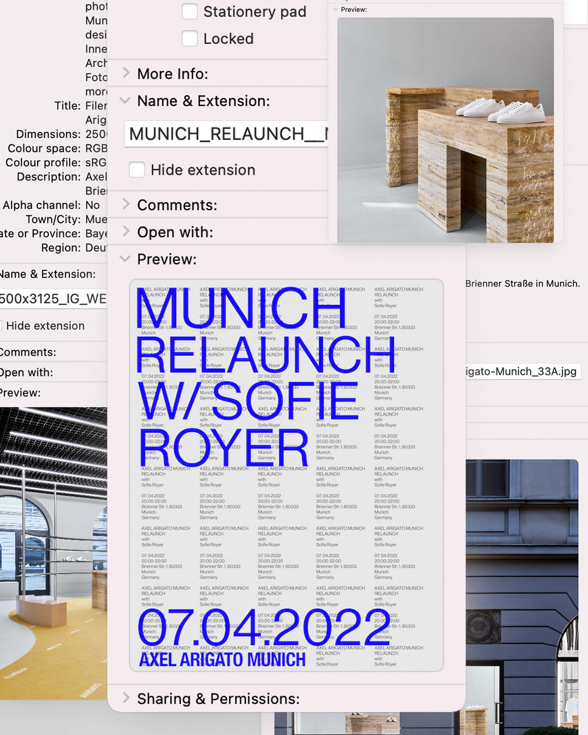
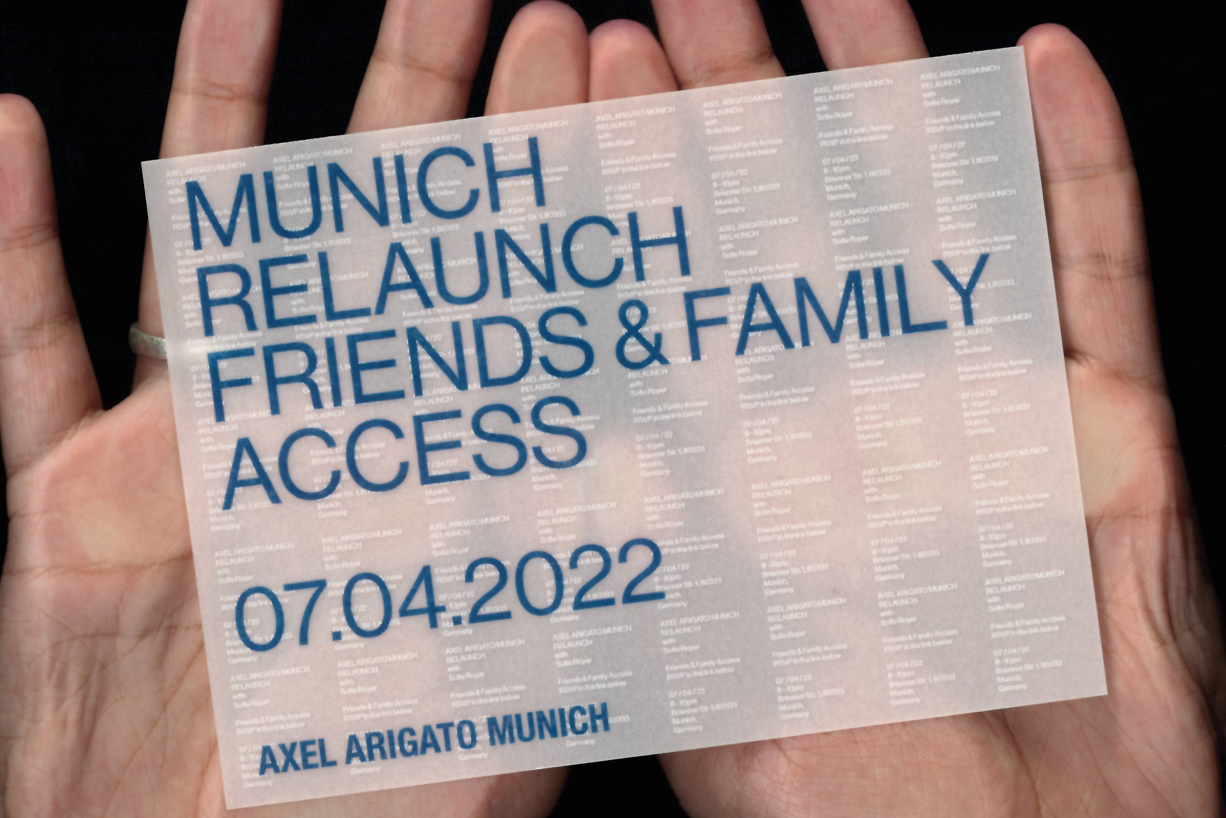
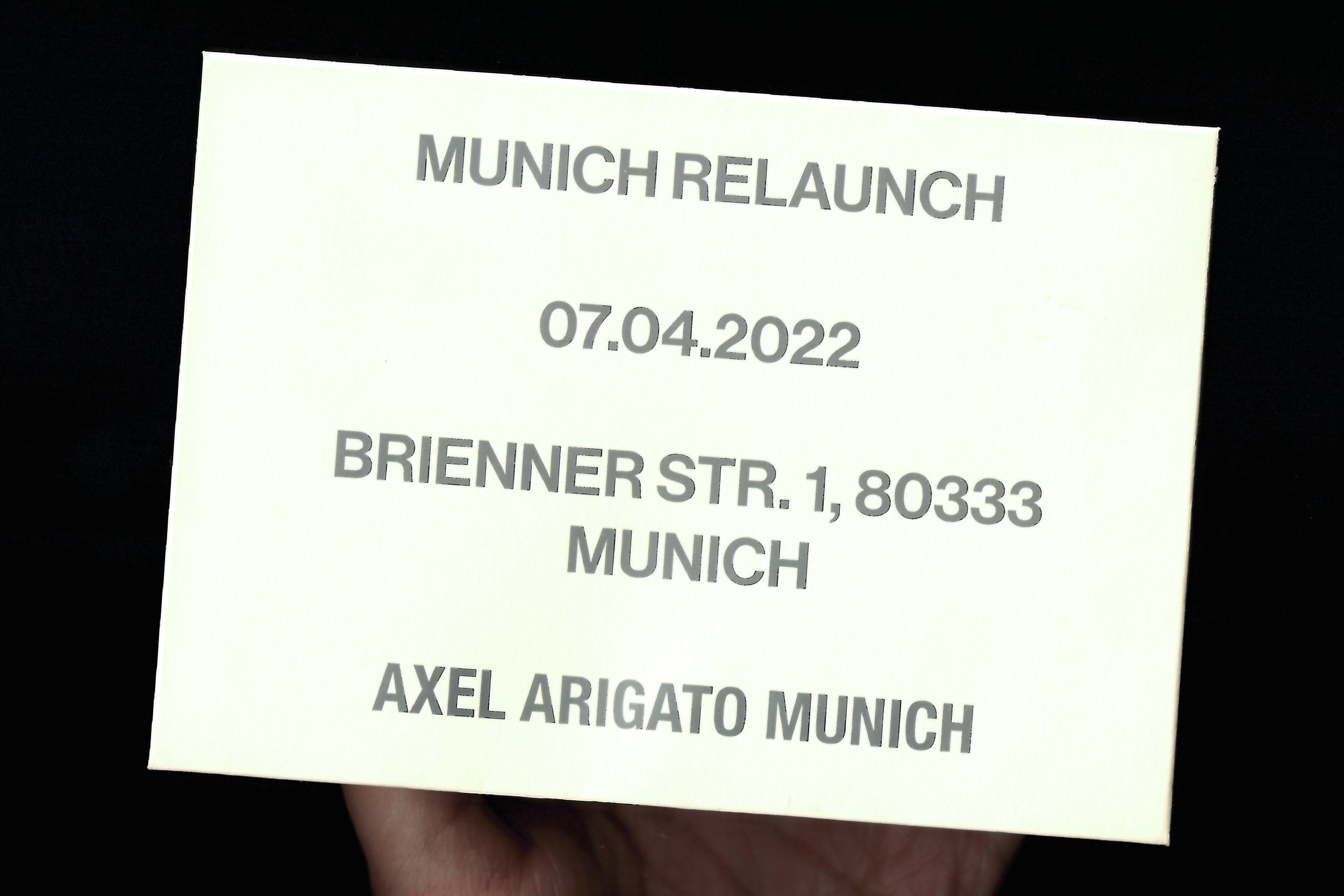
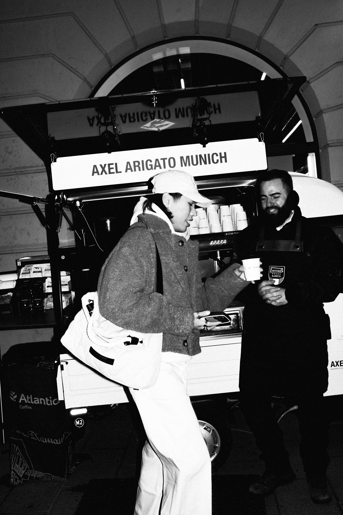

Axel Arigato Munich Store Relaunch 2022
Graphic Direction, Print & Digital, OOH
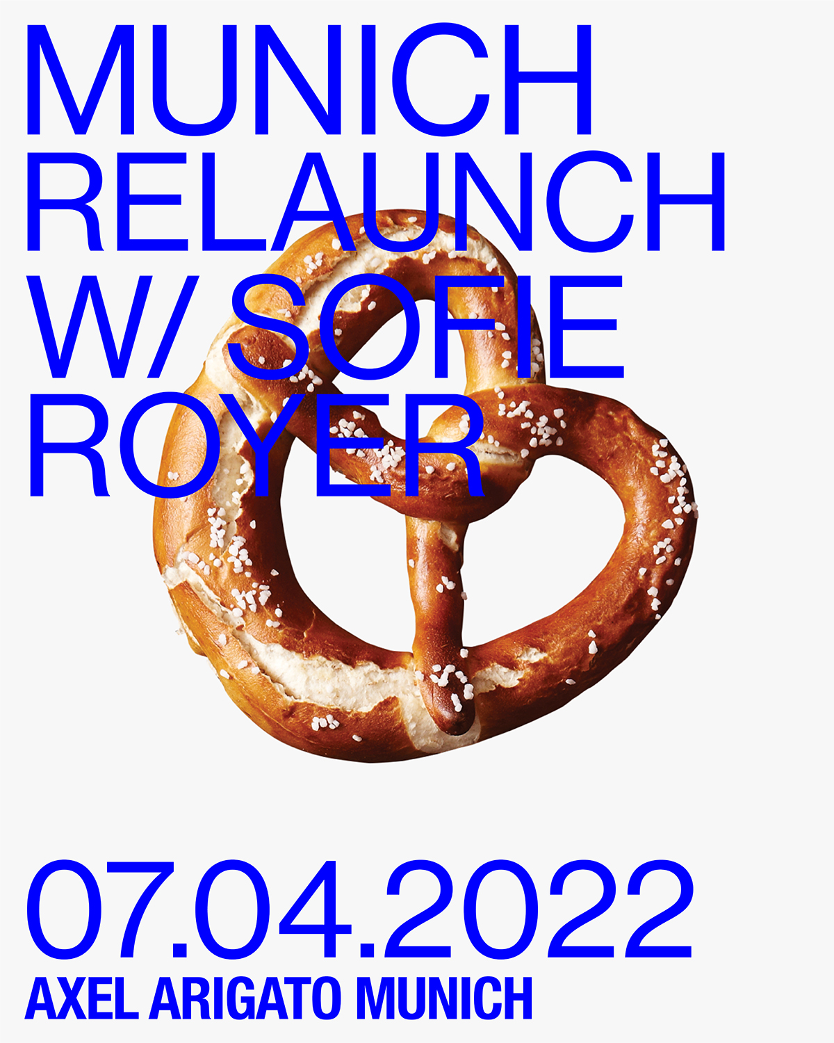
Aligning with the relaunch of our latest store in Munich, we brough an energised creative direction that brings a striking colour palette that stems from the brands visual origins, and powerful typographic usage that heroes messaging for our newly formed customer. Alongside the graphic direction, we brough an OOH affair throughout the city, by throwing special events & moments.
Typeface: Neue Haas Grotesk
Photographer: Daniel Nguyen
Print: Lunch Press
Collabarator: Anna Lura
Axel Arigato Munich Store Relaunch 2022
Graphic Direction, Print & Digital, OOHAligning with the relaunch of our latest store in Munich, we brough an energised creative direction that brings a striking colour palette that stems from the brands visual origins, and powerful typographic usage that heroes messaging for our newly formed customer. Alongside the graphic direction, we brough an OOH affair throughout the city, by throwing special events & moments.
Typeface: Neue Haas Grotesk
Photographer: Daniel Nguyen
Print: Lunch Press
Collabarator: Anna Lura
Photographer: Daniel Nguyen
Print: Lunch Press
Collabarator: Anna Lura
-------
Ted Baker Outerwear Collection AW19
Art Direction, Campaign
The nights are drawing in and everyone’s talking about that undeniable chill in the air: it’s officially time for outerwear. Paying homage to the changing of seasons and the changing to a warmer wardrobe, Our AW19 Outerwear campaign brought together a earthy, tonal colour palette that complimented the product.
Videography: Curtis Taylor
Photographer: Matt Aland
Head of Creative: Matt Damsell
Stylist: Jack Mills
Ted Baker Outerwear Collection AW19
Art Direction, CampaignThe nights are drawing in and everyone’s talking about that undeniable chill in the air: it’s officially time for outerwear. Paying homage to the changing of seasons and the changing to a warmer wardrobe, Our AW19 Outerwear campaign brought together a earthy, tonal colour palette that complimented the product.
Videography: Curtis Taylor
Photographer: Matt Aland
Head of Creative: Matt Damsell
Stylist: Jack Mills
Photographer: Matt Aland
Head of Creative: Matt Damsell
Stylist: Jack Mills


Renli Su SS22 Lookbook
Art Direction, Photography
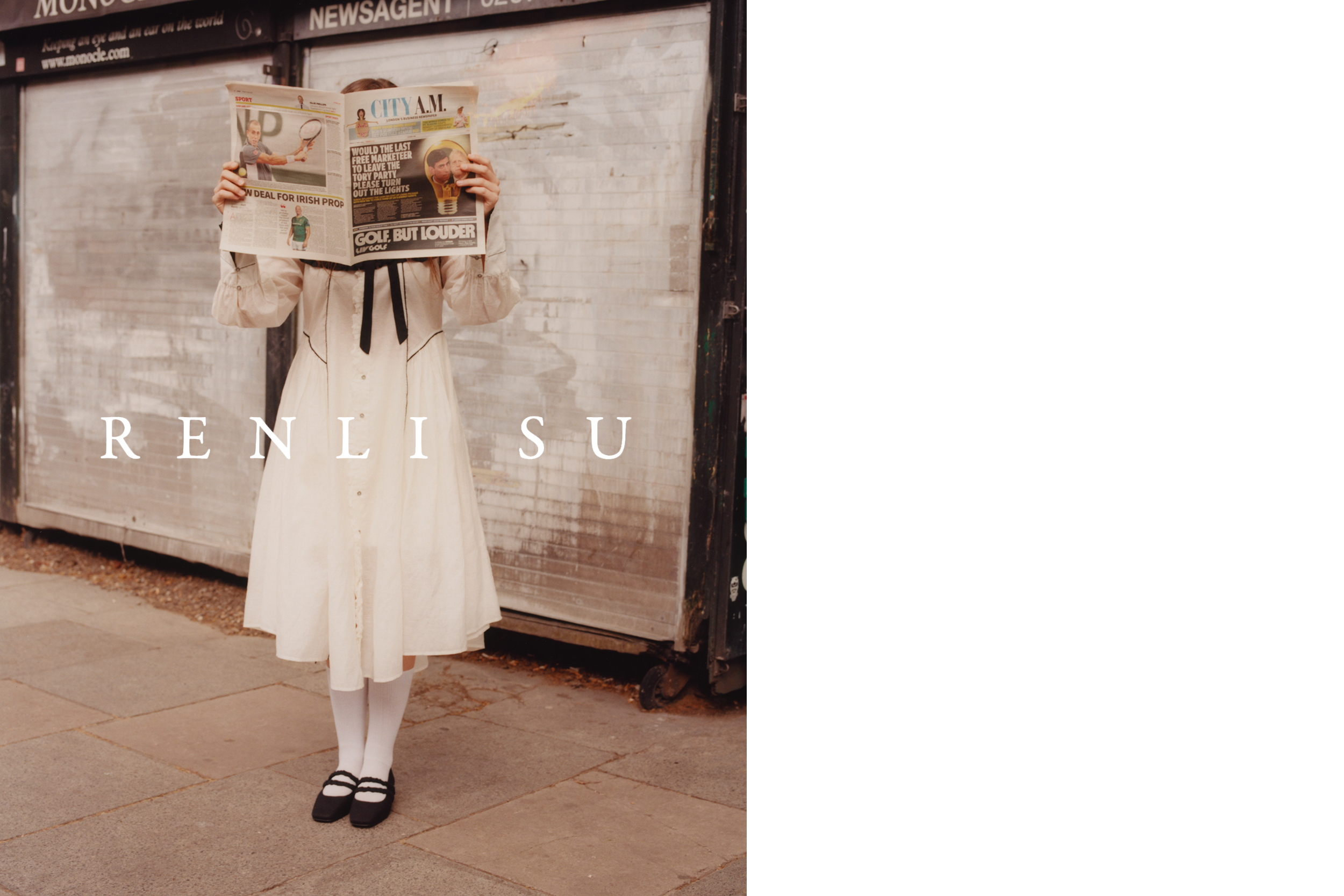
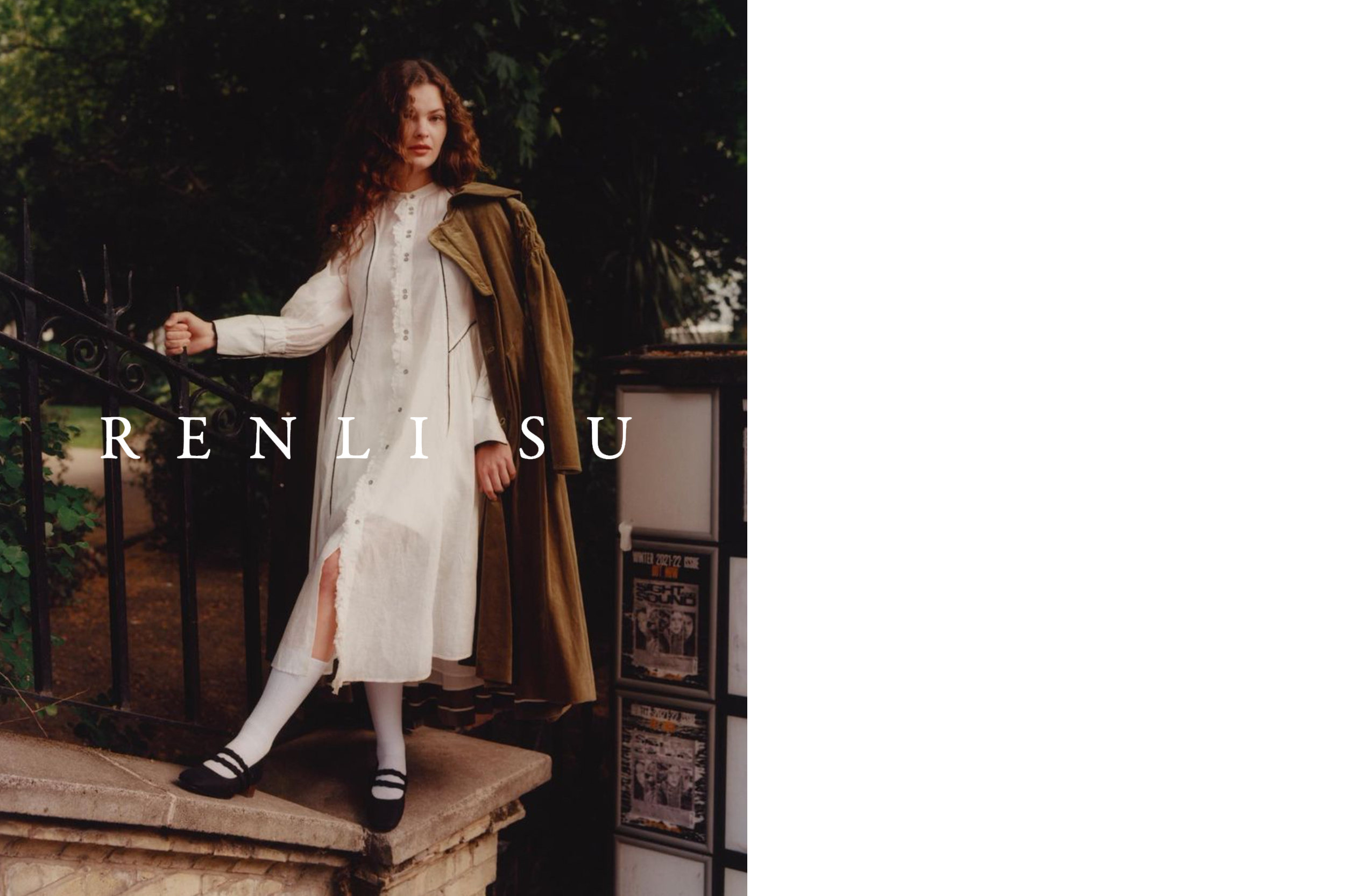
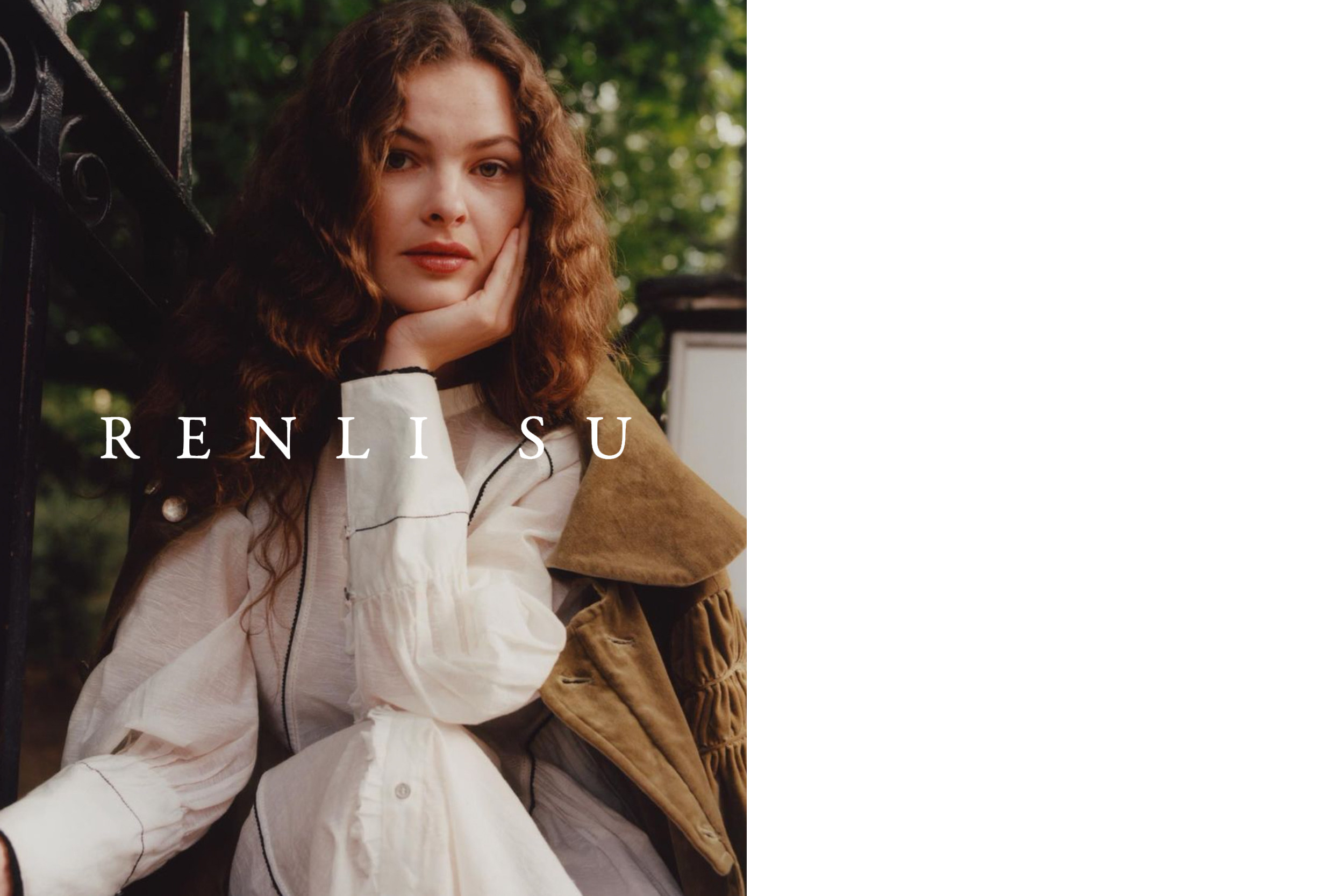
A Chinese-born womenswear designer brand take inspiration from British culture. Bringing pieces from her SS22 collection to life through the heart of London on location, capturing the matched synergy between the SS22 collection & the vibrant city landscape
Photographer: Nathan Singh
Assistant: Liam Young
Art Direction: Nathan Singh
Styling: Joey Yip
HMU: India Rose
Renli Su SS22 Lookbook
Art Direction, PhotographyA Chinese-born womenswear designer brand take inspiration from British culture. Bringing pieces from her SS22 collection to life through the heart of London on location, capturing the matched synergy between the SS22 collection & the vibrant city landscape
Photographer: Nathan Singh
Assistant: Liam Young
Art Direction: Nathan Singh
Styling: Joey Yip
HMU: India Rose
Assistant: Liam Young
Art Direction: Nathan Singh
Styling: Joey Yip
HMU: India Rose

The Reservoir - “The Creative Supply of Emerging Talent”
Art Direction, Campaign
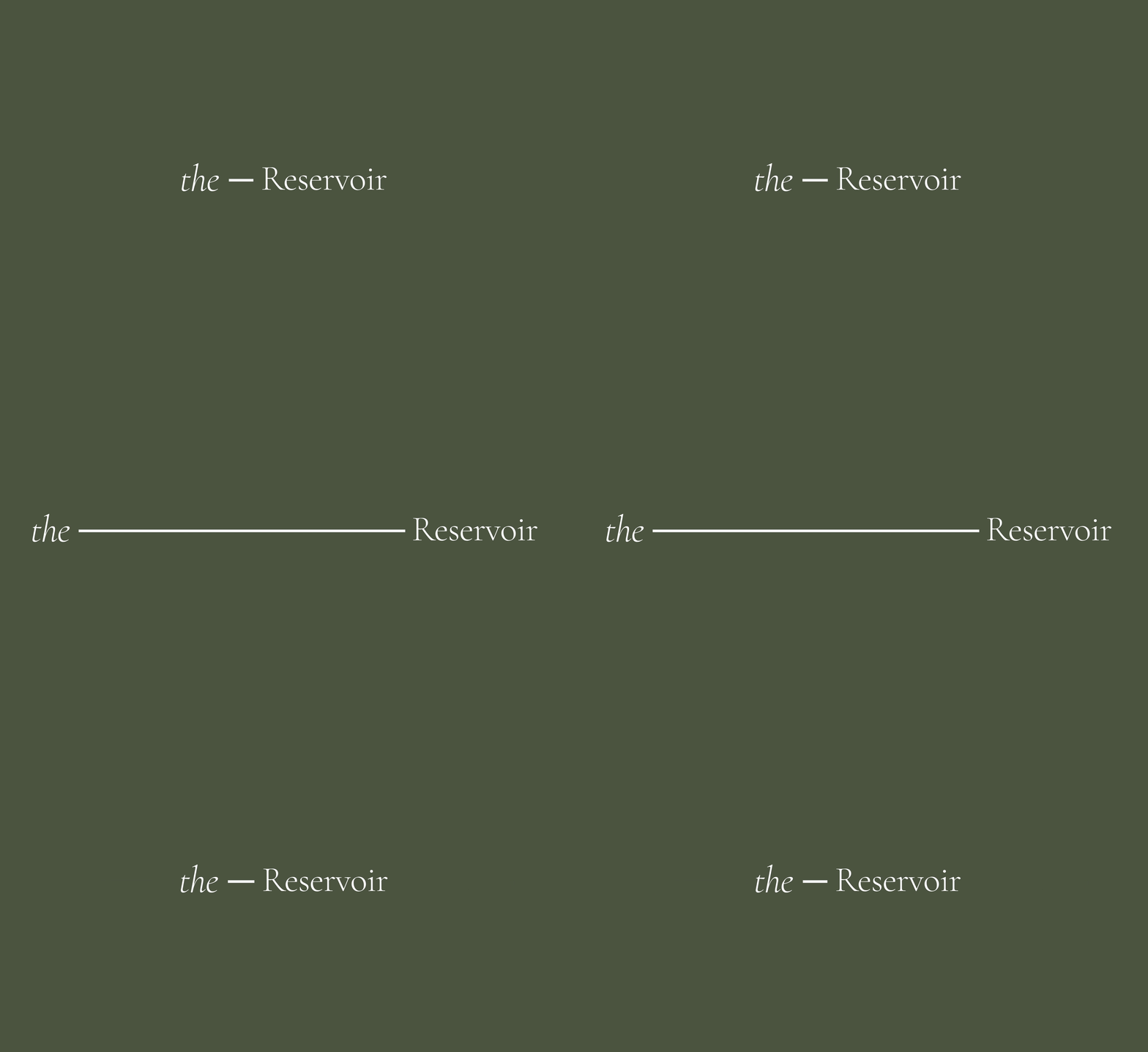
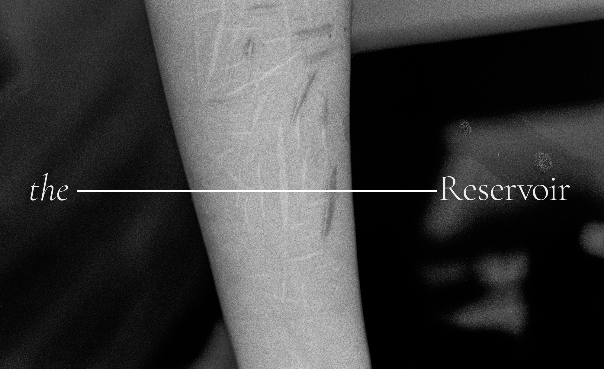
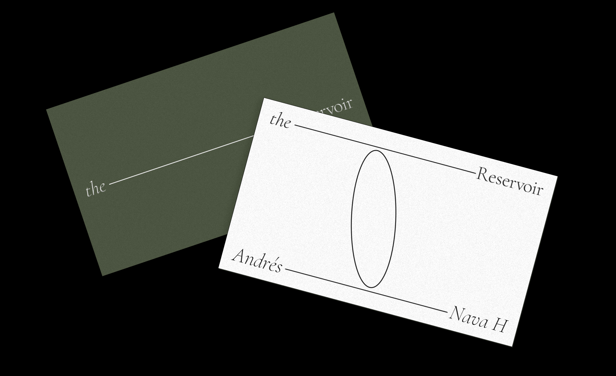
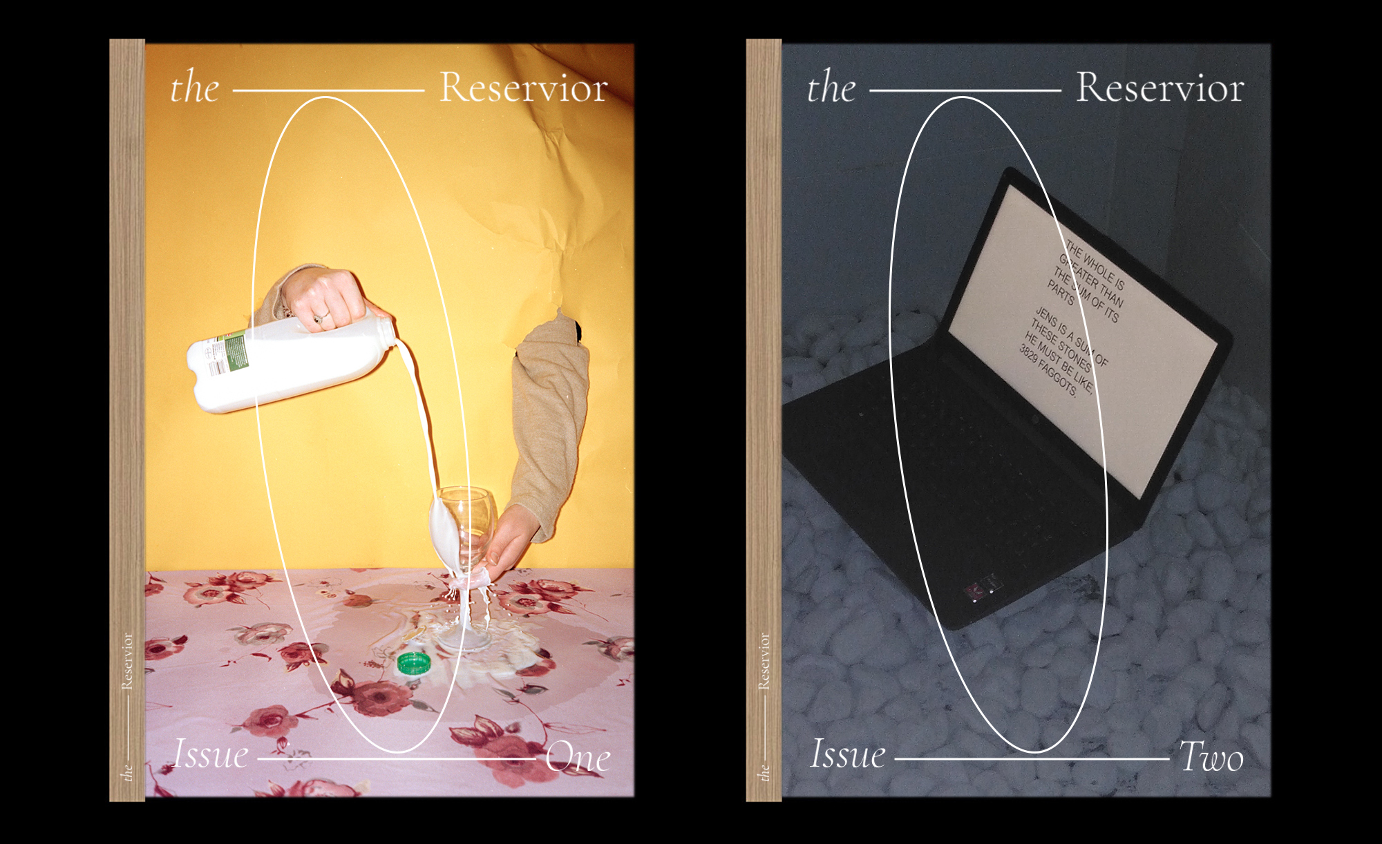
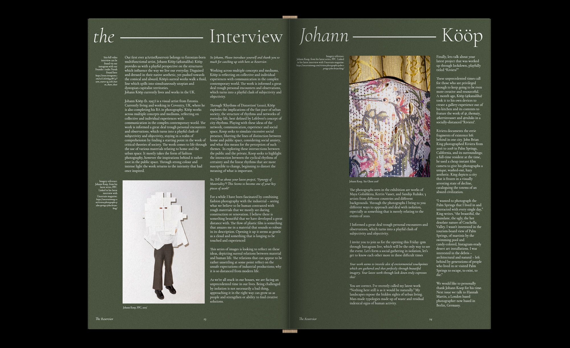
The Reservoir (Founded 2019) is a multipurpose platform for emerging creative talent to showcase the depth of our young community from around the world. Bringing to life artists latest work through print and digital formats that celebrate the artists on-going imaginative journeys. The branding pulls notions from its direct word origins by using a French designed typeface (Cormorant Garamond Light), whilst taking design structures and hierarchy around the manmade creation of these artificial waters. The way in which reservoirs are built, the typographic/image hierarchies are determined by the fabricated boundaries set by the page dimensions and artists name, creating personalised arrangements within our visual house style.
The Reservoir - “The Creative Supply of Emerging Talent”
Art Direction, CampaignThe Reservoir (Founded 2019) is a multipurpose platform for emerging creative talent to showcase the depth of our young community from around the world. Bringing to life artists latest work through print and digital formats that celebrate the artists on-going imaginative journeys. The branding pulls notions from its direct word origins by using a French designed typeface (Cormorant Garamond Light), whilst taking design structures and hierarchy around the manmade creation of these artificial waters. The way in which reservoirs are built, the typographic/image hierarchies are determined by the fabricated boundaries set by the page dimensions and artists name, creating personalised arrangements within our visual house style.